How to Use the Swoosh Element Properly in Logo Design
Well, well, well… if it isn’t you, dear reader! You’ve stumbled upon this blog post about the infamous swoosh element in logo design. The swoosh, that curved and swirly line that seems to be everywhere, can make or break a logo design. But how do you use it properly? That’s what we’re here to talk about.
Let’s be honest, the swoosh has been overused to the point of exhaustion, and yet it’s still used frequently in logo design. You might be thinking, “Why bother to write a blog post about it?” But fear not, my friend, we’re going to dive deep into the world of swooshes and uncover the secrets of using them effectively in logo design.
So, sit tight, grab a cup of coffee, and let’s explore the exciting world of swoosh elements in logo design!
What is a swoosh element?
Ah, the swoosh element. It’s a classic design element that’s been used in logo design for years. But what is it exactly?
Well, a swoosh element is a curved or swirly line that can be used in logo design to add a sense of movement, fluidity, or gracefulness to a design. It can be thick or thin, long or short, and can be used in a variety of ways to convey different messages. Here’s an example:
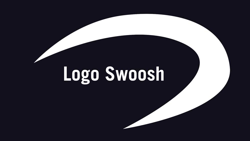
Swoosh elements can be found in all kinds of logos, from sports brands to fashion labels. They can represent a range of things, such as speed, agility, flexibility, or elegance. They can also be used to create a sense of flow, to guide the viewer’s eye across the design, or to frame other elements in the logo.
In short, the swoosh element is a versatile design element that can be used in a multitude of ways to enhance the overall impact of a logo.
Tips for using swoosh elements in logo design
Now that we know what a swoosh element is, let’s talk about some tips for using it effectively in logo design. Here are a few things to keep in mind:
- Consider the brand and its message
The swoosh element should be used in a way that supports the brand and its message. For example, if the brand is all about speed and agility, a swoosh element might work well. However, if the brand is more serious and professional, a swoosh might not be appropriate. - Keep it simple
Swoosh elements are best when kept simple and clean. Avoid adding too many details or making the swoosh too complicated, as this can detract from the overall impact of the logo. - Use the swoosh to convey motion or direction
Swoosh elements are great for conveying a sense of motion or direction in a design. Use them to create a feeling of movement or to guide the viewer’s eye across the design. - Avoid overusing the swoosh
While swoosh elements can be effective, it’s important not to overuse them. A logo that relies too heavily on a swoosh element can quickly become cliché and unoriginal. - Experiment with different shapes and sizes
Swoosh elements come in all shapes and sizes. Don’t be afraid to experiment with different shapes and sizes to find the one that works best for the brand and the overall design of the logo.
By keeping these tips in mind, you can use the swoosh element to create a logo that is both effective and visually appealing.
Examples of successful logo designs that use swoosh elements

To help you better understand how swoosh elements can be used effectively in logo design, let’s take a look at a few real-life examples of successful logos that use swoosh elements:
- Nike: The Nike swoosh is one of the most iconic swoosh elements in the world. It’s simple and sleek and represents the brand’s focus on speed and agility.
- SpaceX: The SpaceX logo uses a swoosh element to create the shape of a rocket launching into space. This conveys the brand’s focus on innovation and exploration.
- Amazon: The Amazon logo uses a swoosh element that also doubles as a smile, representing the brand’s focus on customer satisfaction and happiness.
- UPS: The UPS logo uses a swoosh element in the form of a shield to represent the brand’s focus on security and reliability in shipping and delivery.
- Citibank: The Citibank logo uses a swoosh element on top of i’s to create a sense of movement, which is appropriate for a bank that offers financial solutions and services.
Common mistakes to avoid when using swoosh elements
While swoosh elements can be effective in logo design, there are also some common mistakes that designers should avoid. Here are a few things to watch out for:
Overusing the swoosh
One of the biggest mistakes designers make is overusing the swoosh element. A logo that relies too heavily on a swoosh can quickly become cliché and unoriginal.
Using a generic swoosh
Another mistake designers make is using a generic or stock swoosh element. This can make a logo look cheap and unoriginal, and can also detract from the brand’s message.
Using a swoosh that doesn’t fit the brand
It’s important to choose a swoosh element that fits the brand and its message. Using a swoosh that doesn’t fit can be confusing and misleading for consumers.
Making the swoosh too complex
While swoosh elements can be effective, it’s important to keep them simple and clean. Making the swoosh too complex can detract from the overall impact of the logo.
Using a swoosh as a logo
Finally, using a swoosh as a logo can be a mistake. It’s important to remember that a swoosh is just one design element and should be used to enhance the overall impact of the logo, not as a replacement for other design elements.
What next?
And that’s a wrap, folks! Swoosh elements can be a fantastic way to add movement, elegance, and style to a logo design. But just like any design element, they can also be overused and misused.
As a designer, it’s important to keep in mind the brand’s message and image when choosing a swoosh element, and to use it in a way that complements the overall design.
Remember to avoid the common mistakes we talked about, and you’ll be well on your way to creating a memorable and effective logo that makes a lasting impression on your audience. Keep on designing, and have fun with it!
Looking for Simple and Elegant Logo Design Service?
Mrvian is a professional designer who has this style type. Even though the outcome is a simple design but it comes from a thoughtful process in order to produce the most suitable brand for the target audience and brand value. Check out my portfolio to get a feel of my style and don’t hesitate to contact me.

