The University of Helsinki Logo Meaning, PNG & Vector AI
The University of Helsinki, located in the vibrant city of Helsinki, Finland, holds a rich history dating back to 1640 when it was founded as the Royal Academy of Åbo in the city of Turku, then part of the Swedish Empire. Today, it stands as the oldest and largest institution of academic education in Finland, attracting a diverse community of 40,000 students and researchers from around the world.
Renowned for its excellence in research and education, the University of Helsinki consistently secures a place among the top 100 universities in international rankings. Over the centuries, the university has harnessed the power of science to make significant contributions to society, education, and welfare.
When it comes to its logo, the University of Helsinki has a truly unique logo that holds significant value, deserving of exploration. In this article, we explore the fascinating meaning behind the University of Helsinki logo that is embedded within its brand design.
The University of Helsinki Logo Meaning
Symbol

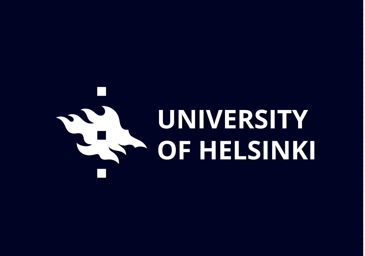
The University of Helsinki’s logo showcases a distinct symbolism through an abstract wavy shape and three vertically stacked squares. This unique design holds significant meaning, with each element conveying a specific representation.
The abstract wavy shape featured in the logo represents the dynamic nature of knowledge, innovation, and progress. It signifies the ever-evolving academic pursuits and research endeavors carried out by the university. This fluid shape also reflects the University of Helsinki’s commitment to adaptability and embracing change in the pursuit of intellectual growth.
The wavy shape featured in the University of Helsinki logo holds a connection to the geography of Finland, the home country of the university. Finland is known for its abundance of lakes and water bodies, and the wavy shape in the logo may be reminiscent of the country’s beautiful aquatic landscapes.

Finland is often referred to as the “Land of a Thousand Lakes,” and its geography is shaped by numerous interconnected lakes, rivers, and coastal areas. These water features are an integral part of Finland’s identity and have played a significant role in its culture and history.
The three vertically stacked squares within the wavy shape hold symbolic significance as well. The central square, positioned in the heart of the wavy form and portrayed in negative space, represents the core values of the university. It serves as a focal point, highlighting the importance of knowledge, collaboration, and academic excellence at the center of the institution.
The two squares flanking the central one symbolize the pillars of teaching and research, forming the foundation on which the university stands. They represent a strong academic framework and a harmonious balance between scholarly pursuits and the dissemination of knowledge.
Though it makes sense, It’s important to note that the interpretation provided above is a speculative representation based on design principles and symbolic associations. It does not reflect the official meaning or intended symbolism of the University of Helsinki logo as communicated by the institution.
Color
The University of Helsinki has chosen to incorporate a nearly black color, specifically the hex code #000222, into its logo design. The utilization of this dark shade reflects a deliberate aesthetic choice aimed at creating a visually striking and sophisticated impression.
While the exact reasons for selecting #000222 as the specific color for the University of Helsinki logo may not be explicitly stated, the use of a nearly black shade contributes to the overall visual appeal and communicates a sense of professionalism, depth, and authority.
PNG & Vector AI

Format: Adobe Illustrator (AI)
Artboards: 2
Size: 58 KB


