Top 10 Dental Clinic Logos in the USA
In a world where dental care plays a pivotal role in our lives, the quest for a radiant smile is undeniably significant. Across the vast landscape of the United States, numerous dental clinics thrive, each dedicated to ensuring that your smile remains wide and your confidence soars. But in a sea of dental businesses, how does one create a logo that truly stands out?
If you’re embarking on the journey of starting your own dental clinic or looking to revamp your existing brand, you’re in the right place. Join us as we delve into the realm of dental clinic logos in the USA, unveiling the top 10 designs that promise to enrich your inspiration and help your logo shine amidst the competition.
Discover the artistry, innovation, and uniqueness that lie behind these dental logos, each contributing to the vibrant tapestry of the American dental care landscape.
Jacksonville Emergency Dental

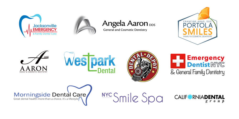
The Jacksonville Emergency Dental logo is a simple yet effective design. It consists of two curvy lines in aqua and blue, forming the outline of teeth. Underneath, a red heartbeat line signifies emergency care. This logo conveys the essence of dental services, emphasizing both oral health and the urgent nature of their assistance.
Angela Aaron DDS

The Angela Aaron DDS logo features a distinctive “A” created from an abstract line. This line is rendered in a modern and sophisticated 3D glossy grey style, giving it a sleek and contemporary appearance. The unique design of the “A” embodies the practice’s commitment to dental excellence and innovation, making it a memorable and professional representation of Angela Aaron DDS.
Aaron Family Dentistry

The Aaron Family Dentistry logo is a masterpiece of simplicity and elegance. It revolves around the modification of the calligraphic letter ‘A,’ rendered in black. This elegant ‘A’ letterform undergoes a subtle transformation, where the horizontal line is ingeniously replaced with the silhouette of a toothbrush. This creative twist seamlessly blends sophistication with dental care, resulting in a unique and graceful logo.
Portola Smiles

The Portola Smiles Family and Cosmetic Dentistry logo boasts a distinctive hexagonal shape with a vibrant orange flower gracefully positioned on the right side. This creative use of geometry and nature elements signifies balance and a commitment to holistic dental care. Within the hexagonal frame, the practice’s name and slogan find their place, reflecting professionalism and a warm, welcoming approach.
West Park Dental

The West Park Dental logo exudes modernity with its sleek, glossy finish in a soothing light blue hue. What sets it apart is its uniqueness – the letter “W” in the logo cleverly resembles a tooth, accentuated by a distinctive “t” in vibrant green. This innovative design seamlessly blends dental imagery with contemporary aesthetics, making it instantly recognizable and memorable.
Dental Depot

The Dental Depot logo stands out distinctly in the dental industry due to its unique and unconventional design. At its core, the logo features the image of an old train locomotive, an exclusion from traditional dental imagery. The overall logo setup evokes a classic Western circle emblem, reminiscent of a vintage railroad insignia. This creative approach not only sets Dental Depot apart but also reflects their theme of a train station throughout their clinic.
Emergency Dentist NYC

The Emergency Dentist NYC logo prominently features a red box with a distinctive plus symbol, symbolizing medical emergencies. The slogan is presented in a casual typeface, creating a balanced and straightforward visual identity that conveys the warm and friendly touch of their services while maintaining approachability.
Morningside Dental Care

The Morningside Dental Care logo is a sleek and modern design that prominently features an outline of teeth. This dental emblem gracefully partially covers the end of the practice’s name. The predominant color used is a soothing purple, which is both visually appealing and conveys a sense of professionalism. Overall, the logo is simple and contemporary.
NYC Smile Spa

The NYC Smile Spa logo adopts a sleek and contemporary approach with its wordmark format. It features a clean and elegant geometric typeface, exuding a sense of modernity. In this design, “Smile Spa” takes center stage as the focal point, with “NYC” appearing in a smaller font size. This arrangement not only highlights the essence of the spa experience but also subtly alludes to its location in New York City.
California Dental Group

The California Dental Group logo features a distinctive sun icon in light blue, creatively integrated as the letter “O” in “California.” This design choice aligns seamlessly with California’s iconic theme of sunny weather and warmth, offering a welcoming and location-specific touch to its branding.
That’s our roundup of the top ten dental clinics to inspire your logo design journey. Designing a logo can be a complex and challenging task. If you require any assistance with creating your logo, please feel free to reach out to me for expert guidance and support.


