5+ Greatest Logo Design Example for Healthcare Clinics That Will Boost Your Business
A good logo isn’t just a pretty picture; it’s the first vibe patients get about a place that’s supposed to keep them healthy. In the healthcare world, where trust and care are everything, a unique logo can set a clinic apart from the sterile, cookie-cutter competition. So, we’ve rounded up 10 examples of healthcare clinic logos that nail it—blending creativity, personality, and that all-important “you’re in good hands” feel. Whether you’re a designer looking for inspo or a clinic owner wanting to up your branding game, these picks are worth a look. Let’s dive into it!
First on the list is a logo with a stethoscope shaped like a heart. It’s a straightforward nod to doctors and care, wrapped in a calm light blue. Simple, clean, and says ‘healthy’ without trying too hard—great for a clinic going for that easy, trusting feel.

Next up is an abstract butterfly logo that looks like a person striking a healthy pose. It’s a cool way to hint at vitality and well-being without overcomplicating things. The soft gradient of blue and aqua adds a calming, relaxed touch—perfect for a clinic that wants to feel uplifting and peaceful at the same time.
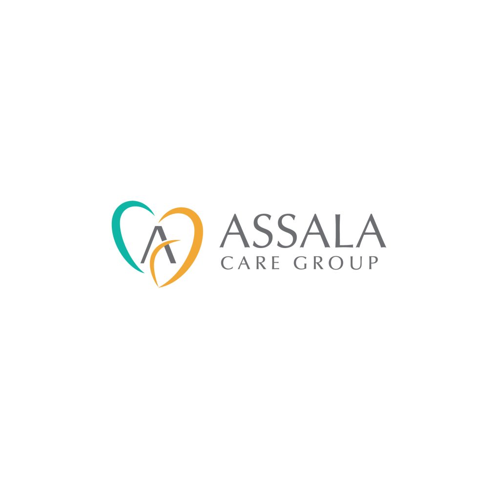
The third one brings back the heart element, but with a twist—there’s a hidden ‘ACG’ tucked into the design, though you’ve got to squint a bit to catch it in its abstract glory. The teal keeps that medical vibe going, while a pop of orange throws in some energy. It’s a smart pick for a clinic that’s all about balance—professional yet lively.
Fourth up is a logo that takes a globe and curves it into an ‘S’ shape—no cliché medical symbols here. It’s subtle yet still gives off that healthcare feel in a quiet, classy way. Perfect for a clinic that wants to keep it low-key but still connected to the idea of global care or wellness.
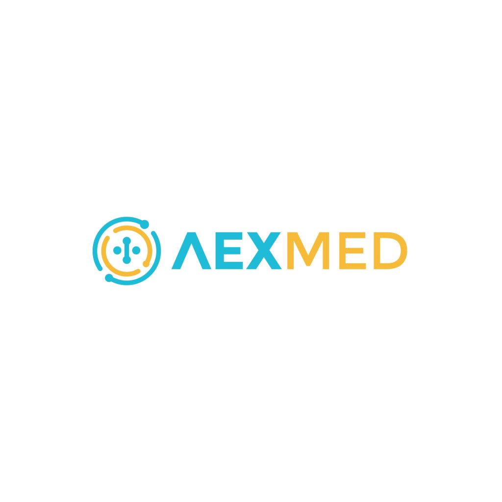
Fifth on the list is a techy vibe, tailor-made for a medical device company. You’ve got these abstract nodes that scream electricity, all circling around a center where they connect into a plus symbol. It’s sleek and modern—ideal for a clinic or brand that’s pushing the cutting-edge side of healthcare tech.
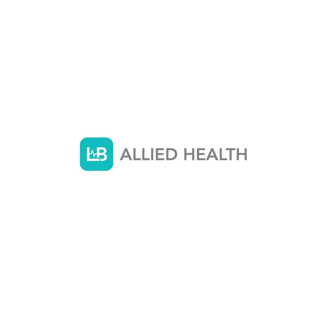
Sixth up is a clean, iconic rounded square featuring the initials ‘LB.’ What makes it stand out is the slick EEG pulse line slipped into the space between the L and B. It’s compact, balanced, and ties in that healthcare feel without overdoing it—great for a clinic that wants simple but sharp branding.
So, that’s the rundown—6 distinct logos that give healthcare clinics a fresh, meaningful look. They prove a touch of creativity can make a big difference in connecting with people. If you’re thinking about a logo for your clinic or brand, I’d love to help. I specialize in designing custom logos that feel just right for you. Feel free to reach out—let’s create something special, no rush, no pressure!