Tempe High School Logo Review
People in Australia, especially those teenagers could try some High Schools like this one. Tempe High School is one of the best educational departments led by the New South Wales Government
Tempe High School is a high school in Sydney, Australia that provides an excellent education to its students.
The school was founded in 1874 and has been providing quality education for over 100 years. The school is located in Tempe, NSW, and has a population of more than 1,000 students.
Tempe High School provides an environment where the teachers and staff are dedicated to the success of their students. Students who attend this school will have everything they need to build their future success.
Tempe High School has been recognized as an Excellence School by the New South Wales Department of Education and Communities. This means that they have met all of the criteria for excellence in teaching, learning, leadership, and student engagement.
Tempe High School offers a wide range of courses for students to choose from including English, Mathematics, Science, Religion, Technological and applied studies, Art, and Sports. They also offer vocational courses such as Automotive Technology or Hospitality Management which can lead to employment opportunities after graduation.
Tempe High School Logo Review
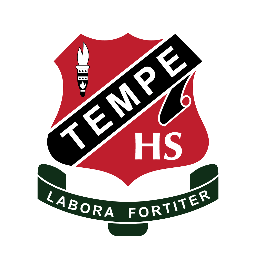
The Tempe High School logo is a shield shape with a red color. The shield shape is a symbol of protection and the red color represents the spirit of the school. The unique torch symbol in the top left of the shield shape represents the spirit of its education for the future.
The Tempe High School logo has a modern font and it is written in all capital letters. This makes it look more professional and formal. But there is the initial HS written in elegant serif Optima font which stands for High School.
This logotype is very useful for coats of arms of school attributes, such as uniforms, caps, wall signs, etc. And most university use this type including Harvard, Cambridge, and Toronto.
Its slogan is written on the unique ribbon, Labora Fortiter means to strive to achieve or work hard. That is a strong motivational and positive word to build the future mindset.
Colors
There are several colors included in the logo itself, which is also an important element of visual communication.
Red at #be1e2d: Red can be interpreted as courage, spirit, willpower, strength, and energy.
Dark Green at #102d18 is a dark color tone that has meaning of ambition, wealth, success, and future.
Conclusion
Tempe High has a great logo. Opting for a solid red coat of arms and adding simple modern typography to a traditional emblem makes this new school logo fit with its surroundings. The logo can attract students to join their educational organization and of course, it increases the confidence of parents as well, because the brand identity conveys value prestigious and quality.
Looking for Simple and Elegant Logo Design Service?
Mrvian is a professional designer who has this style type. Even though the outcome is a simple design but it comes from a thoughtful process in order to produce the most suitable brand for the target audience and brand value. Check out my portfolio to get a feel of my style and don’t hesitate to contact me.

