Unleashing the Power of Typography in Logo Creation
When it comes to creating a logo, typography plays a crucial role. The art and technique of arranging type can have a big impact on how a logo is perceived, and the right typeface can help to convey a brand’s personality and values. It will even more important for wordmark-based logo, which makes their own name as a logo.
In this article, we’ll explore the importance of choosing the right typeface, the role of hierarchy in typography, the benefits of custom typography, and the impact of kerning and leading on the overall appearance of a logo. Whether you’re designing a logo for your business or for a client, understanding the role of typography in logo design can help you create a professional, legible, and memorable design.
The importance of choosing the right typeface
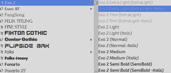
When it comes to designing a logo, the typeface you choose can make a big impact on how it’s perceived. It’s crucial to choose a typeface that’s appropriate for your brand and target audience. Different typefaces can convey different moods and personalities, so it’s important to choose one that aligns with your brand.
For example, a sleek and modern typeface might be perfect for a tech company, and the majority of it is sans-serif though, while a more traditional typeface, like a serif style, might be better for a law firm. Another one is handwriting font which fits with brands that want to communicate humanity. The key is to choose a typeface that reflects your brand’s personality and values and will resonate with your target audience.
Also, it’s important to keep in mind the legibility of the typeface you choose. You want to make sure that your logo is easy to read, especially when it appears in small sizes. So, it’s a good idea to choose a typeface that is clear and easy to read, even in smaller sizes. Remember, the typeface you choose for your logo is an important factor in creating a memorable and effective design.
The Role of Hierarchy in Typography
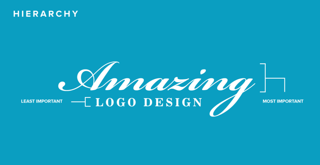
It’s important to think about how the elements of the design will be arranged in terms of importance. This is where hierarchy comes in. By using different font sizes, weights, and styles, you can create a sense of hierarchy and guide the viewer’s eye to the most important information. For example, if the name of your brand is the most important element of the logo, you might use a larger font size and bolder weight for that text. This will make it stand out and be the first thing that people notice.
Hierarchy can also be created by using different styles of typography. For example, you might use a script font for the brand name and a more traditional font for the tagline. This creates a contrast and makes the different elements of the logo stand out from each other.
Additionally, by creating a sense of hierarchy in your logo design, you can help to ensure that your message is communicated clearly and effectively. Overall, it’s important to think about how different elements of your logo will be arranged in terms of importance and how it will be perceived by the audience.
The Use of Custom Typography
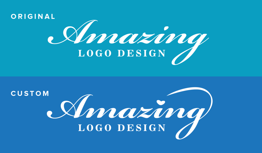
One unique approach to logo design is the use of custom typography. Custom typography is a typeface that is designed specifically for a brand, and it can help to make a logo truly unique and memorable. By creating a custom typeface, you have the ability to create a design that is truly one-of-a-kind and can’t be found anywhere else.
Custom typography can come from modifying the existing font family or creating a whole new set of the font family. But make sure you have the right to modify the font if your logo typography is derived from another author.
Nevertheless, because the typeface is specifically designed for the brand, it will align perfectly with the brand’s personality and values. This can help to create a strong and distinct visual identity that sets the brand apart from its competitors.
You may like 6 Psychological Keys to Memorable and Effective Logo
The role of kerning and leading
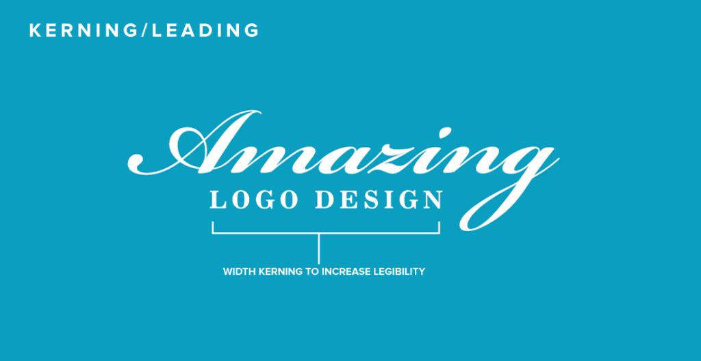
Last but not least, it’s also worth considering the importance of paying attention to the small details. One of those details is the kerning and leading of the text. Kerning refers to the space between individual letters while leading refers to the space between lines of text. By adjusting these spaces, you can create a more balanced and legible design.
For example, if the letters in a word are too close together, it can be difficult to read and understand the text. On the other hand, if the letters are too far apart, it can make the text appear disconnected. Similarly, if the lines of text are too close together, it can create a cramped and cluttered appearance. But, if the lines are too far apart, it can make the text appear disconnected and unorganized. By adjusting the kerning and leading to creating a more balanced design, you can make sure that your logo is easy to read and understand for your target audience.
Conclusion
To conclude, typography plays a crucial role in logo design, and it’s important to carefully consider the typeface, hierarchy, and kerning and leading when designing a logo. By choosing the right typeface and using it effectively, you can create a logo that is professional, legible, and memorable.
Looking for Simple and Elegant Logo Design Service?
Mrvian is a professional designer who has this style type. Even though the outcome is a simple design but it comes from a thoughtful process in order to produce the most suitable brand for the target audience and brand value. Check out my portfolio to get a feel of my style and don’t hesitate to contact me.

