The Dos and Don’ts of Logo Redesigns
A logo is often the first thing that people notice about a business, and as such, it’s important to make sure that it represents the company in the best possible way.
Redesigning a logo can be a significant undertaking, and it’s important to approach the process carefully to ensure that the redesign is successful. In this article, we’ll explore the do’s and don’ts of logo redesigns, including what to consider before starting the process, how to gather feedback, and how to unveil the new design.
By following these guidelines, businesses can make sure that their logo redesign is a positive step forward for their brand.
Do understand your brand and target audience

Before you start the redesign process, it’s important to have a clear understanding of your brand’s values, mission, and target audience. This will help guide the redesign process and ensure that the new logo aligns with your brand’s identity.
Understand what makes your brand unique and what message you want to convey with the new logo. Research your target audience and consider their preferences, needs, and behaviors. This will help you create a logo that resonates with them and effectively communicates your brand’s message.
By understanding your brand and target audience, you’ll be able to create a logo that truly represents your business and appeals to your customers.
Don’t make drastic changes

While it’s important to update and modernize a logo from time to time, it’s generally a good idea to avoid making drastic changes to the design. A drastic change can be confusing and disorienting for customers, and it can take time to establish recognition and trust with the new design.
Ditching a recognizable element of the logo that has been associated with the brand for a long time may lead to a loss of brand recognition and confuse the audience. Instead, focus on making subtle updates to the design that preserve the core elements of the logo while modernizing it. This can be done by updating the color palette, typography, or overall composition of the logo.
An example that includes this technique is Google logo evolution as we see above. Google keeps its colorful letter as its base branding strategy while changing letter style and shadow style.
By making incremental changes, businesses can ensure that the new logo is still recognizable and that the transition to the new design is smooth and seamless.
Do test your new design

Before finalizing your redesign, it’s a good idea to test the new design out and gather feedback from a focus group or online survey. This will help to ensure that the new design resonates with your target audience and meets their needs and preferences.
Conducting user testing will give you valuable insights into how the design is perceived and if it effectively communicates your brand’s message. Test the new design with different demographics and gather their feedback, this way you can see how the design is perceived by different groups of people.
Additionally, you can also conduct A/B testing to compare the new design against the old one and see which one performs better in terms of recognition and appeal.
By testing the new design and gathering feedback, businesses can make any necessary adjustments before the redesign is officially launched, and it will ensure that the redesign is a success.
Don’t neglect the importance of simplicity

A simple logo is often more effective than a complex one. A simple logo is easier to remember, recognize, and reproduce, and it also allows your brand to adapt to different mediums and applications more easily.
Simplicity means that the logo can be easily scaled to fit any size without losing its impact and readability. A simple logo is also versatile and can be applied to different mediums such as print, digital, and even embroidered on a shirt, without losing its impact. Complex logos often have too many details and elements that make them difficult to remember and reproduce.
So, while a complex logo may seem impressive, it may not be as effective in the long run. By keeping the design simple, businesses can ensure that their logo is effective and easily recognizable across different mediums and applications.
Do consider the scalability of your design
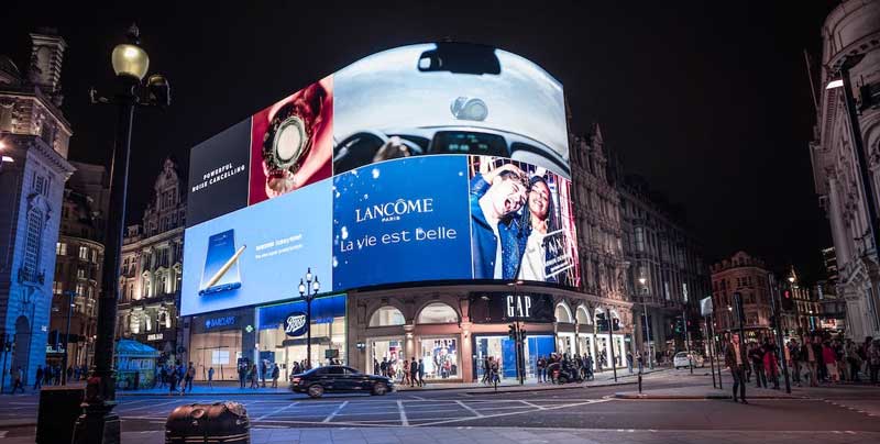
Your logo should look good at any size, from small social media icons to large billboards. Make sure to design your logo with scalability in mind so that it looks sharp and professional no matter where it is used.
A scalable logo design should be created in vector format, which is a type of format that allows the logo to be resized without losing its quality. This is important as it ensures that your logo will be legible and recognizable across different mediums and applications. It’s also important to consider the use of negative space and simple shapes, as they can make a logo more scalable.
When a logo is simple and easy to recognize, it becomes more adaptable to different sizes and environments. By considering the scalability of the design, businesses can ensure that their logo looks professional and consistent across different mediums and applications.
Conclusion
Redesigning a logo can be a challenging process, but with careful planning and consideration, it can be a successful and rewarding endeavor. By following these dos and don’ts, you can create a new logo that is effective, memorable, and consistent with your brand’s identity.
Looking for Simple and Elegant Logo Design Service?
Mrvian is a professional designer who has this style type. Even though the outcome is a simple design but it comes from a thoughtful process in order to produce the most suitable brand for the target audience and brand value. Check out my portfolio to get a feel of my style and don’t hesitate to contact me.

