RBC (Royal Bank of Canada) Logo Meaning, History, PNG & Vector AI
Hey there! I’m a logo design enthusiast. That’s why I wanted to write this article about the RBC logo and its meaning. If you’re not familiar with RBC, it’s one of the largest banks in Canada and one of the largest banks in the world based on market capitalization. They’ve been around for over 150 years and offer all kinds of financial services, from personal banking to investments and insurance.
But why am I writing about a bank logo, you might ask? Well, as someone who loves logo design, I always find it fascinating to learn about the thought process behind creating a logo. The RBC logo is particularly interesting because it’s gone through several changes over the years and has a lot of symbolism behind it. Plus, RBC is committed to helping clients thrive and communities prosper by supporting strategic initiatives that make a measurable impact on society, the environment, and the economy. So, if you’re curious about the RBC logo and its meaning, keep reading!
RBC Logo Shape
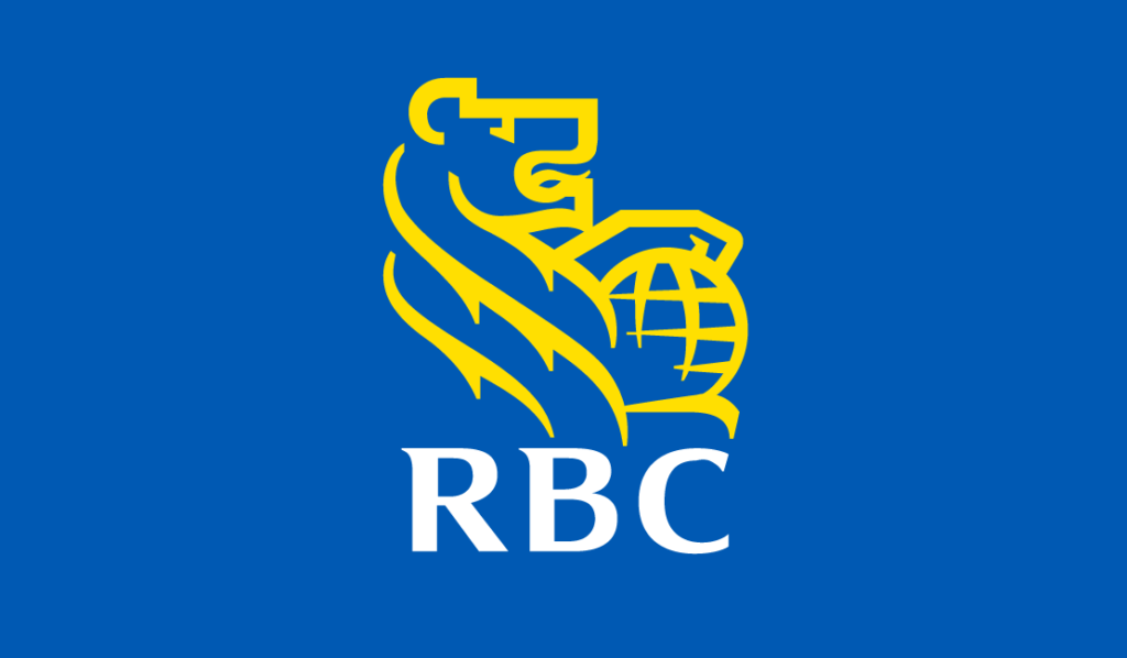
The RBC logo is all about that fierce lion! With its paw resting on a globe, the lion has been a part of RBC’s badge since the early 20th century, symbolizing strength and authority. In fact, RBC’s first logo in 1962 featured a heraldic motif with a lion proudly keeping its paw on a globe, representing the bank’s international presence.
But that’s not all! The lion holds a special significance in Canada as well. It represents courage and valor, just like in the Arms of Canada where the lion is depicted above the helmet, symbolizing Canada’s sovereignty. The flags held by the lion and unicorn on the sides of the arms also represent Canada’s founding nations, France and England, adding a touch of national pride to RBC’s logo.
The lion and globe in the RBC logo are depicted with a distinctive style of drawing that adds to their symbolism. The lion is rendered with sharp edges and bold yellow lines, giving it a powerful and commanding presence. The use of bold lines conveys a sense of strength and confidence, while the sharp edges add a touch of modernity and sophistication to the design.
Similarly, the globe in the logo is also portrayed with sharp edges and bold lines, enhancing its visual impact. The simplicity of the design, with its clean lines and minimalistic approach, adds to the overall strength and authority of the logo.
So, the RBC logo not only reflects the bank’s strength and global presence but also its deep connection with Canada and its rich heritage. It’s a perfect blend of symbolism that resonates with RBC’s identity and values.
RBC Logo Color

The colors of the logo are blue, yellow, and white. Blue represents trust as seen in many institutions including Toronto University, while yellow represents creativity and goodness.
The RBC logo colors are an important aspect of their brand identity, as they create recognition and visual cohesion across their communications. The core colors are RBC Bright Blue, RBC Dark Blue, and RBC Yellow, which are based on the Pantone® color codes: Pantone® 286, Pantone® 289, and Pantone® 116, respectively. RBC Bright Blue is a dominant color that represents the strength and stability of the brand, while RBC Yellow adds a pop of brightness and energy. RBC Dark Blue provides a sense of depth and sophistication to the color palette.
RBC Bright Blue:
- Hex Code: #0051A5
- CMYK: 100/60/0/6
- RGB: 0/81/165
RBC Dark Blue:
- Hex Code: #002750
- CMYK: 100/55/0/60
- RGB: 0/39/80
RBC Yellow:
- Hex Code: #FEDF01
- CMYK: 0/10/100/0
- RGB: 254/223/1
RBC also uses a range of accent colors that fall within a specific color palette. These accent colors are chosen based on their compatibility with RBC’s brand identity and are intended to complement the primary colors used in RBC’s logo.
To view the list of accent colors and their corresponding hex codes, you can visit RBC’s official brand guidelines.
RBC Logo Font
The font used in RBC’s logo is bold and elegant, with sharp lines and pointed elements that add a touch of sophistication. Specifically, in the letter mark that appears below the iconic lion symbol. Based on my research, RBC’s logo font is similar to the Innovage Bold font with slight modifications made to the letter “C”. This font choice is perhaps selected to reflect RBC’s visual identity and convey its brand message.
The Innovage Bold font is known for its bold, modern, and prestigious appearance, which aligns perfectly with RBC’s image as a progressive and forward-thinking financial institution. The slight modification made to the original letter in the RBC logo font may be unique to RBC’s brand, adding a customized touch to make the logo distinctively recognizable.
The combination of the lion symbol and the chosen font creates a harmonious and memorable visual representation of the RBC brand.
RBC Logo History
The history of the RBC logo is rich with symbolism and evolution.
1869

It all started in the early days of 1869, when the original founders of the Merchants’ Bank of Halifax, who were established maritime merchants, chose a modern three-mast sailing ship with an auxiliary engine as the centerpiece of the bank’s first corporate seal. This ship was believed to have belonged to one of the bank’s original directors, William Cunard. The seal, which was black and white and featured a circular emblem with the text “Merchants Bank of Halifax – Incorporated 1869” and the drawing of the sailing ship in the center, underwent a slight revision in 1901 to reflect the new corporate name “The Royal Bank of Canada”.
1901
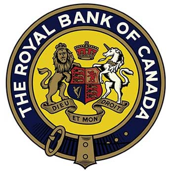
The 1901 name change marked the Royal Bank’s national expansion, and a new logo was designed to emphasize the “Royal” name. The new seal, which still maintained its circular emblem, now featured the text “The Royal Bank of Canada” surrounding and inside the circle, with an image of a lion and a horse facing a shield and a crown with text in a ribbon below it, bearing the motto “Dieu Et Mon Droit”.
1962

In 1962, the Royal Bank introduced its first unique emblem as a logo, featuring a heraldic motif that could be used effectively on buildings or savings account passbooks. Only two elements from the 1901 seal were retained: the lion, symbolizing strength and authority, and the crown, continuing the “royal” symbolism. The new logo also added a globe to represent the bank’s global presence. This version of the logo, in black and white and depicted in a line style, became one of Canada’s most recognizable corporate icons.
1974

In 1974, the “Lion and Globe” design underwent a modification to simplify the image. The lighter lines, which provided details such as the feathering on the lion’s mane, were removed, leaving behind the primary lines. This clean and modern version of the logo was well-suited for three-dimensional signage and represented a shift in Royal Bank’s corporate identity.
2001 – Now
In 2001, Royal Bank introduced a new master brand, “RBC Financial Group” (shortened to “RBC” in 2007), to reflect its evolution into a diversified financial services company. The new logo retained the traditional lion and globe but with a simplified design and brighter colors. The lion and globe were now colored yellow and contained within a blue shield, symbolizing the bank’s optimism and forward-facing approach to the future. This logo design continues to pay homage to tradition while honoring the bank’s strong Canadian roots.
PNG Collection
Explore the collection of high-quality RBC Logo PNG transparent images. Simply click on the images that catch your eye and manually save them to your computer using your browser’s download feature.

Vector AI
I’ve included an RBC logo in vector AI format. By downloading the logo in this format, you’ll have the flexibility to use it in various sizes and formats without losing quality. Simply click the download button below to get the Bing logo in AI format and start incorporating it into your own designs but make sure you read their official brand guide.
Format: Ai (Adobe Illustrator)
Artboard: 4
Size: 72.4 KB

