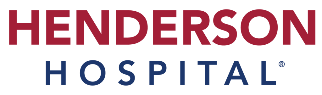
Henderson Hospital Logo Review & PNG
Henderson Hospital is a Joint Commission-accredited facility located in Henderson, Nevada. With 297 beds, it offers comprehensive medical and surgical services to area residents, including specialties in emergency care, childbirth services, and cardiac care. The hospital is part of The Valley Health System, which provides patient care throughout Las Vegas and Southern Nevada.
Henderson Hospital is dedicated to providing safe and quality care to its patients. The hospital has received an “A” grade in the Leapfrog Hospital Safety Grade for the ninth consecutive period and has been named a Top Teaching Hospital nationally by The Leapfrog Group. The hospital is also active in the local community, participating in blood drives, community outreach, and public service messages.
Its mission is to deliver the leading-edge, evidence-based quality of care and comprehensive education to every patient all the time, with the vision of improving patients’ health and enriching lives through partnerships, compassion, and innovation.
Read also Centura Health Logo Review PNG & Vector AI
Henderson Logo Symbol

Henderson’s Logo is not only visually striking, but it also perfectly represents the hospital’s brand and values. The imagery of the mountain and the rising sun behind it in an abstract style is a perfect representation of the hospital’s mission and vision of improving patients’ health and enriching lives.
The mountain, drawn using a one-stroke line style in dark blue color #1d376c, represents strength, stability, and a sense of groundedness, which are all qualities that one would want in a healthcare facility.
Similarly, the partial red disk of the sun, using solid red color #a31f37, represents hope, optimism, and a sense of renewal, which are all qualities that one would want in a healthcare facility that cares for its patient’s health.
The combination of these two elements in the logo creates a powerful and meaningful symbol that accurately represents the Henderson hospital brand and the values it holds.
In addition to representing the hospital’s brand and values, the mountain imagery in Henderson’s logo also aligns with a prominent feature of the state of Nevada – the mountains. Nevada is known for its beautiful mountain ranges, including the Sierra Nevada and the Great Basin Ranges.
This makes the mountain imagery in the logo a perfect match for the location of the hospital as it is situated in Nevada. The use of the mountain imagery in the logo not only aligns with the hospital’s mission and vision but also connects the hospital with its local community and the state’s landmark feature.
It adds a local touch and sense of belonging to the logo which makes it more relatable and memorable to the local community.
Henderson Logo Typography
Henderson Logo uses a geometric font that is easy to read and gives off a modern and professional look. Based on my observation, the font seems to be Sultan Nahia Regular by Linotype. This font is chosen for its clean and simple lines, which perfectly complements the abstract imagery of the mountain and sun in the logo.
The layout of the text is stacked in two lines, with the primary title, “Henderson,” at the top and “Hospital” below it as the least important hierarchy. This layout clearly establishes the hierarchy of the text and makes it easy for the viewer to read and understand.
The font color also follows the same color scheme as the logo icon, with red used for “Henderson” and blue used for “Hospital.” This consistency in color usage creates a cohesive look and ties the text and imagery together seamlessly. The choice of font and color also align with the hospital’s brand and values, such as being modern, professional, and easy to read.
Conclusion
To conclude, the Henderson logo is a well-designed and effective representation of the hospital’s brand and values. The icon, consisting of a mountain and a rising sun, is a powerful and meaningful symbol that aligns with the hospital’s mission and vision, as well as the state of Nevada’s landmark feature.
The use of color and the one-stroke line style in the icon gives it a modern and abstract look, which is visually pleasing and easy to recognize.
The typography used in the logo is clean and simple, which perfectly complements the icon. The layout of the text is clear and easy to read, and the use of color is consistent with the icon, creating a cohesive look. Overall, the Henderson logo effectively communicates the hospital’s brand and values in a visually pleasing and memorable manner.
Looking for Simple and Elegant Logo Design Service?
Mrvian is a professional designer who has this style type. Even though the outcome is a simple design but it comes from a thoughtful process in order to produce the most suitable brand for the target audience and brand value. Check out my portfolio to get a feel of my style and don’t hesitate to contact me.