Chewy Logo Review, PNG & Vector AI
Chewy is a retail company in the USA that focused on Pet Care products such as food, toys, vitamins, accessories, healthcare services, etc. This company was born in 2011 by Ryan Cohen and Michael Day, its headquarters is located in Dania Beach, Florida, U.S. In 2017 this company dominate 50% of pet food sales and having a merge with PetSmart which is an established company in the same niche.
In addition to food, they also offer pet care services for all kinds of pets animal including horses, cats, dogs, birds, fish, reptiles, and small animals. For their professionalism and quality, they got an award as Top 10 Employer Brand and America’s Best Customer Service. Chewy ranked along 500 companies of the largest U.S. companies by revenue.
Chewy’s logo Review
The Chewy brand was designed by Zachery Lewis a Creative Director from Austin, TX. He makes rules for all aspects of Chewy branding including colors, illustrations, type, and photo standards.
Shape
Chewy has a logo is a wordmark-type logo. It uses a soft-curved typography style in a random letters angle and overlapping each other. It gives the audience the playful feel and cute characteristics of a pet. It is the almost similar visual strategy of the baby-related brands that people tend to put their love in.
The rounded font of the Chewy wordmark is very bold, making it easy to read and enhancing clarity when scaled down to a small size.
Based on my observation, the Chewy logo uses a modified Swiss 721 Rounded Black Font as we can see in the comparison below.
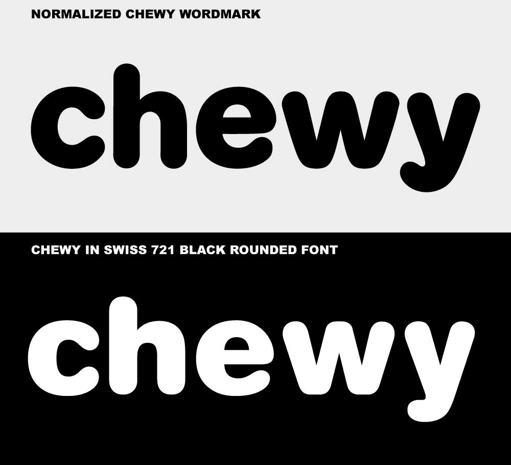
The basic shape curve is almost identical, with a few iterations that can be applied to the Swiss 721 Rounded Black Font will make it exactly like the Chewy wordmark especially by smoothening the curve at each angle.
Letters c, h, and e seem downsized a bit in vertical width and increase curve smoothness at the same time. On the w letter, we can see the zig-zag angles on the top and bottom are more smooth. The interesting part is on the y letter the tail is boldened and more curve upwards which can remind us of the dog tail.
Colors
Currently, the Chewy brand uses the following color scheme:
New Car Blue #1C49C2 (C:86 M:62 Y:0 K:24) (R:28 G:73 B:194)
Dodger Blue 128CED (C:92 M:41 Y:0 K:7) (R:18 G:140 B:237)
These colors give the fresh look and a youthful feeling and also have the philosophy of open space, freedom, inspiration, and sensitivity.
Conclusion
Overall Chewy logo is very fun, cute, and playful but still has the professionalism and quality value. This brand is easily recognizable among all US citizens especially vets or pet lovers. Easy to apply in all kinds of media and easy to remember. A perfect branding strategy.
PNG & Vector AI

Format: Adobe Illustrator (AI)
Artboards: 1
Size: 51 kb
Looking for Simple and Elegant Logo Design Service?
Mrvian is a professional designer who has this style type. Even though the outcome is a simple design but it comes from a thoughtful process in order to produce the most suitable brand for the target audience and brand value. Check out my portfolio to get a feel of my style and don’t hesitate to contact me.


