Eli Lilly Logo Design History & Review
Eli Llily is an American company that focused on pharmaceutical or chemical medicine. This company’s office is located in Indianapolis, Indiana with branch offices spread over 18 countries in the world.
Founded by veterans of the American Civil War and chemist Colonel Eli Lilly, in 1876 it become one of the oldest companies in the USA. Their service makes the world even more healthy through the discovery of many medications and vaccines including the polio vaccine, human insulin, and drug.
Eli Lilly Logo History
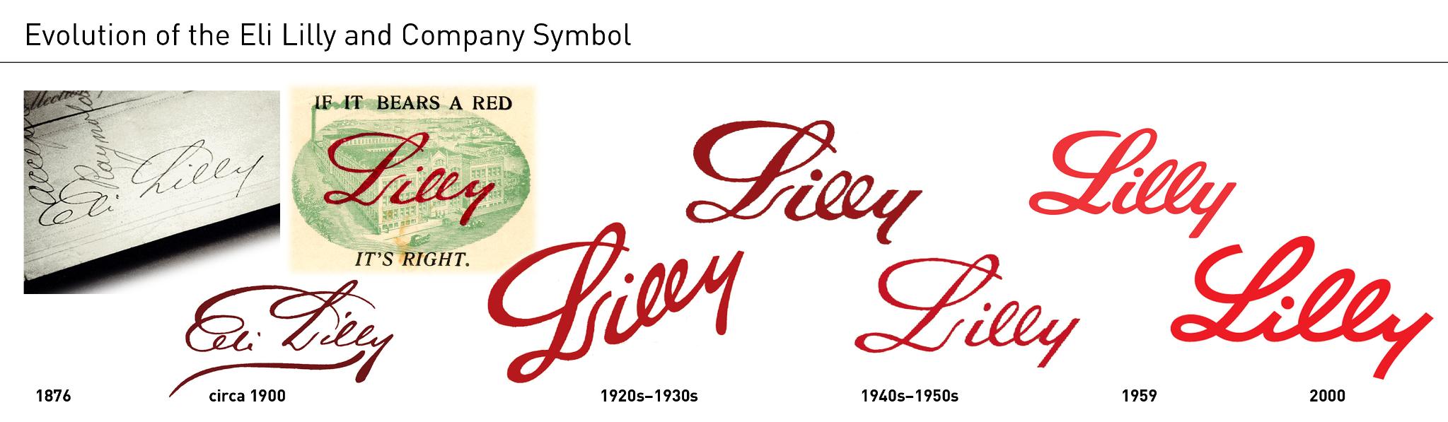
The Eli Lily logo is a wordmark-type logo using the cursive typography style. This basic concept was started in 1876 by using the full name “Eli Lilly until” 1900. Early logo complexity than simplified in 1920 but with an upward direction at the end with only Lilly’s words. In 1940 logo direction was restored to the original version but very light letter stroke width. After 10 years the logo became brighter, clean, and more elegant. From 2000 to the present is the Lilly logo that we see today.
Logo Review
At the first sight, I guess this is a kind of flower company because of its name which has an association with the lily flower. Also, the beautiful cursive font strengthens that feeling but after doing research I found that this is a pharmaceutical company.
Because I do not live in America so doesn’t recognize this brand in my entire lifetime. I just know it lately by reading some articles on the internet.
I found that this is a very old company that consistently keeps its original logo concept. So it’s not necessary to do a major rebranding or make an obvious representation of the company in the logo. All Americans has been recognize that Lilly is a pharmaceutical company since a long time ago.
So logo enhancement is just customizing the letter style to be in with the current design trend. We can see Lilly’s logo evolution tends to become more modern and simple similar to what other companies do with their logo.
Lilly wordmark letter stroke has a fixed width style that makes a modern appearance. But still keep their original letter-writing style.
With red color at #D52B1E, this color name is maximum red. This color theme reminds me of the Pinterest logo although not the same.
Conclusion
Overall Lilly logo has its own identity strategy that preserved for a very long time. A writing style wordmark gives people a personal feel which is in line with its human-focused mission in healthcare. This is great branding for medical companies.
Looking for Simple and Elegant Logo Design Service?
Mrvian is a professional designer who has this style type. Even though the outcome is a simple design but it comes from a thoughtful process in order to produce the most suitable brand for the target audience and brand value. Check out my portfolio to get a feel of my style and don’t hesitate to contact me.


How much money did cost to change the cursive L?
I don’t have that information so far.