IXP Farm Logo Design Philosophy from My 99designs Contest Entry
IXP Farm is on a mission to bring the internet to rural and underserved areas in a new way. By creating a network of Internet Exchange Points (IXPs), they’re building a backbone that’s resilient, cost-effective, and based on industry standards. And they’re doing all of this outside of big cities.
I’ve put a lot of thought and creativity into this project, and I’m determined to create a logo that truly represents IXP Farm and its mission. I’m committed to delivering a design that will leave a lasting impression and accurately reflect the company’s values of innovation, reliability, and accessibility. I aim to create a logo that is sleek and professional, just like IXP Farm itself.
First of all, I must say that this project is pretty interesting. The aspect of decentralization is what truly fascinates me about this project. The idea of distributing the internet infrastructure to rural and underserved areas, rather than relying on centralized hubs, is both inspiring and practical. It demonstrates a commitment to making the internet accessible to everyone, regardless of their location or financial situation.
The logo for IXP Farm needs to capture all of these ideas and more – it’s a big job! In this article, we’ll take a closer look at what I take on what the IXP Farm logo should be all about, submitted as part of a design contest on 99designs.
Designs Concept
After extensive brainstorming and exploration, I am thrilled to present my logo concept for IXP Farm. Guided by the company’s brief, I aimed to bring a fresh, unique, and innovative touch to the design.
My goal was to capture the essence of IXP Farm’s mission to bring reliable, low-cost, and standards-based internet access to rural and underserved areas through a decentralized network of Internet Exchange Points.
I’m confident that this approach will produce a logo that accurately represents IXP Farm and its values.
Globe
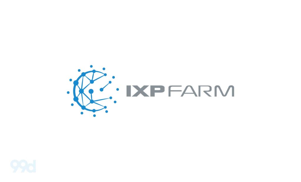
My logo concept for IXP Farm is based on the core idea of decentralization and connectivity. I aimed to visually represent the company’s mission to bring reliable internet access to rural and underserved areas through a decentralized network of Internet Exchange Points.
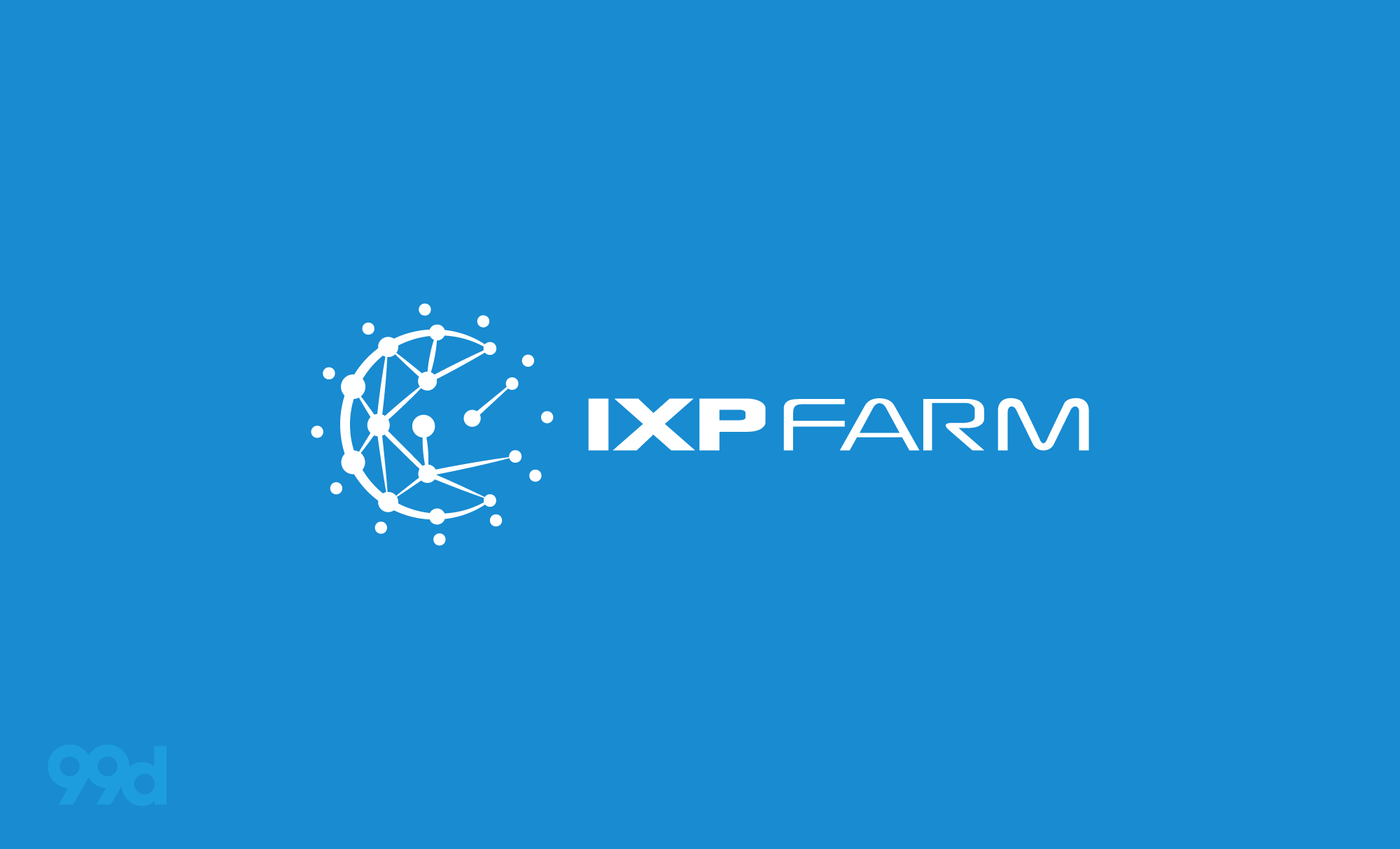
To achieve this, I created a symbol that features connected dots, which represent direct communication and connectivity. The symbol is also covered by an arch line that symbolizes the global reach of the IXP Farm network.
Additionally, there are several dots on the side that represent nodes, further emphasizing the decentralized nature of the network. I believe that this symbol accurately represents IXP Farm and its mission.
For the font, I’ve chosen a modern font called Xscale, which I’ve modified in width for the word “Farm”. The word “Farm” is connected but separated by the weight of the letters, creating a visually interesting effect. To emphasize the importance of both “IXP” and “Farm”, I made “IXP” bolder than “Farm”, while still maintaining a harmonious balance between the two.
The combination of the symbol and font creates a sleek and professional design that accurately represents IXP Farm and its mission. I’m confident that this design will leave a lasting impression and effectively communicate the values of the company.
Read Also Senan’s Stunning Wordmark: A Minimalist Logo for a Modern Recruitment Firm
Colors

For the color scheme, I’ve chosen a bright blue (#188bd1) for the logo symbol to symbolize trust, stability, and technology. The blue color also serves to create a strong visual impact and instantly catches the eye.
For the text, I’ve chosen a neutral gray that complements the blue and provides a clean and professional look. This color combination creates a harmonious balance between the symbol and text and effectively communicates the values of IXP Farm.
Overall, I believe that the color scheme adds to the sleek and professional look of the logo, and I’m confident that it will effectively communicate the values and mission of the company.
Conclusion
I am extremely proud of my design for the IXP Farm logo. I believe that it accurately represents the company’s mission and values, and I’m confident that it will leave a lasting impression.
If you’re interested in seeing my design and how the competition is progressing, you can visit the contest page for a closer look. You’ll be able to view other entries and see the level of competition. I hope you enjoy my design and I’m eager to see the final results!
Looking for Simple and Elegant Logo Design Service?
Mrvian is a professional designer who has this style type. Even though the outcome is a simple design but it comes from a thoughtful process in order to produce the most suitable brand for the target audience and brand value. Check out my portfolio to get a feel of my style and don’t hesitate to contact me.

