Microsoft Bing Logo Meaning, History, PNG & Vector AI
Did you know that Microsoft Bing has recently collaborated with Open AI to introduce a chat-GPT feature in its search results? This exciting collaboration is just one of the many ways in which Microsoft is pushing the boundaries of what’s possible in the world of search engines. This even makes Google’s revenue drop as people begin to migrate to the Bing search engine.
But let’s not forget about the history and meaning behind the Microsoft Bing logo. From its early beginnings in 2009 to the latest iteration, Bing has become one of the most popular search engines worldwide. Its logo has undergone several changes over the years, each one reflecting the company’s evolving identity and brand values. The latest version of the Bing logo, unveiled in 2021, represents the company’s commitment to innovation, accessibility, and user experience.
However, the Bing logo is more than just a visual identity for a search engine. It also carries a deeper meaning and symbolism that resonates with the company’s mission and vision. By analyzing the different elements of the logo, we can gain a better understanding of what Bing stands for and how it communicates its values to its users.
Whether you’re a design enthusiast, a Microsoft fan, or just curious about the history and meaning of logos, this article is for you. We’ll explore the fascinating world of the Microsoft Bing logo, its evolution over the years, and the exciting collaboration between Microsoft and Open AI that hints at what the future of search engines might hold.
Bing Logo History
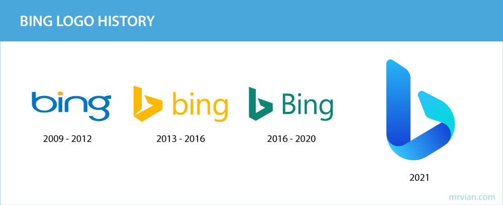
Over the years, the Bing logo has undergone several transformations, reflecting the company’s evolving priorities and changing market trends. Now, we’ll take a closer look at the history of the Microsoft Bing logo, exploring the different versions of the logo, the reasons behind the changes, and what they say about the company’s brand identity and values.
The early years (2009-2012)
- The original Bing logo is a stylized “bing” letter mark in a lowercase letter with a yellow circle above “i”.
- The design was meant to evoke a sense of approachability and friendliness, with the yellow circle representing the sun and the optimistic outlook of the brand.
- However, the logo received criticism for being too similar to that of another company, and it was eventually updated.
The transition to the search experience (2013-2016)
- In 2013, Bing updated its logo to better reflect its focus on search.
- The new logo featured a yellow “b” in the form of a ribbon that bends sharply, it’s like a 3d ribbon silhouette that resembles space.
- The yellow color symbolized joy, happiness, and fulfillment, while the lowercase letters added a sense of informality and approachability.
The little enhancement (2016-2020)
- In 2016, Bing again updated its logo slightly to keep up with changing design trends and to better reflect its modernization efforts.
- The new logo featured a more simple design of “b” without sharp white space, with the word “Bing” in a title case.
- The logo change tends to make logo more analogous to the Microsoft office app logo style.
- The color scheme shifted from yellow to turquoise, representing growth, freshness, and clarity.
The move to modernization (2021)
- In 2021, Bing introduced its latest logo design, which builds upon the previous iteration while also reflecting the company’s commitment to innovation, accessibility, and user experience.
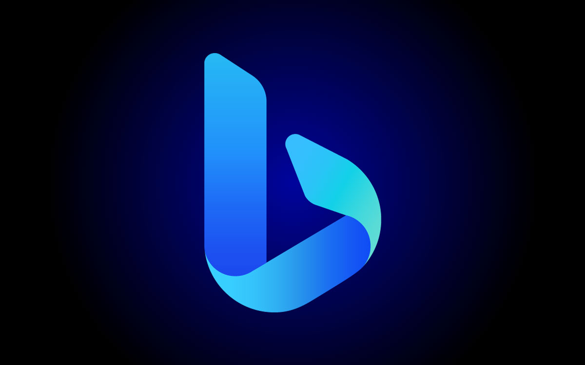
- The new logo features a more three-dimensional look, soft curve edges with a gradient effect that adds depth and visual interest.
- The lowercase “b” remains a central element of the design, while the word “Bing” is now presented in a more modern, sans-serif typeface.
- The color scheme has shifted once again, this time to a bright, vibrant shade of blue that represents energy, intelligence, and clarity.
Reflection on the changes
The changes made to the Bing logo over the years reflect the company’s evolution and changing priorities.
From its early beginnings as a friendly, approachable search engine to its current emphasis on innovation and accessibility, the Bing logo has been updated to better reflect the company’s brand identity and values.
Each iteration of the logo has been carefully designed to convey a specific message and appeal to a particular audience, showcasing the importance of strong branding in the world of search engines.
The Meaning Behind Bing Logo
The current Microsoft Bing logo retains the original ribbon-like design of the lowercase “b,” but with some changes to the shape and color scheme. The edges are now softer and more curved, giving it a more modern and approachable look. On top of that, curved line can also resemble fluidity and faster track, wich may related to their new tecnology.
The logo features a gradient of vibrant blue and aqua colors, which gives it a sense of depth and a futuristic look. The blue color represents trust, intelligence, and dependability, which reflects Bing’s commitment to providing accurate and reliable search results to its users. The aqua color symbolizes freshness, optimism, and creativity, which conveys the company’s focus on innovation and continuous improvement.

The Bing logo is often used in conjunction with the “Bing” text, which is written in the Segoe UI typeface. This combination creates a seamless and consistent visual identity with other Microsoft applications and products, such as Windows and Office.
The Segoe UI typeface is a modern and clean sans-serif font that conveys a sense of professionalism and reliability, which reinforces Bing’s commitment to providing accurate and trustworthy search results. The combination of the Bing logo and the Segoe UI typeface also enhances the brand recognition of Bing and helps to create a cohesive brand experience across all Microsoft products and services.
This focus on innovation and technology is further reflected in Bing’s recent collaboration with Open AI to introduce a chat feature in its search results. By integrating Open AI’s natural language processing technology, Bing aims to provide a more personalized and conversational search experience for its users. This collaboration is in line with the company’s commitment to leveraging the latest technologies to provide the best possible search experience for its users.
Vector AI
I’ve included a Bing logo in vector AI format. By downloading the logo in this format, you’ll have the flexibility to use it in various sizes and formats without losing quality. Simply click the download button below to get the Bing logo in AI format and start incorporating it into your own designs but make sure you read their official brand guide.
Format : Ai (Adobe Illustrator)
Artboard : 2
Size: 58.7 KB

