Nokia Logo History Meaning & Vector AI
Nokia is a company with a rich history that dates all the way back to 1865 in Finland. Nokia has dabbled in various industries over the years, from paper products to rubber boots, but it’s best known for its mobile phones, which seemed to be everywhere at one point. However, Nokia has undergone some changes in recent times and now focuses on telecommunications and technology.
One crucial aspect of branding is the company logo, which serves as the face of the brand and helps people recognize and remember it. A well-designed logo can convey a company’s essence and set it apart from the competition, which is why companies invest so much time and effort into creating the perfect logo.
Meanwhile, this company just introduced a new logo recently after more than a decade. In this post, we’ll delve into the meaning and history behind the Nokia logo, exploring its significance in the company’s journey. So, let’s dive in and uncover the story behind Nokia’s iconic logo!
Logo Meaning

This is Nokia, but not as the world has seen us before. Our new brand signals who Nokia is today. We’re unleashing the exponential potential of networks and their power to help reshape the way we all live and work.
Nokia via LinkedIn
Hey, folks! So, Nokia’s got a fresh new logo that’s all about change and evolution. This company’s been around for over 150 years, going from a paper mill to a telecommunications and technology powerhouse. And this new logo is all about capturing that transformation in a modern and dynamic way.
It’s all about showcasing Nokia’s commitment to innovation and leading the digital transformation game. The logo oozes energy and modernity, reflecting Nokia’s renewed focus and drive to pioneer the future where networks meet the cloud. It’s a bold and confident statement of Nokia’s identity and values, and it’s all about staying ahead of the curve in technological innovation.
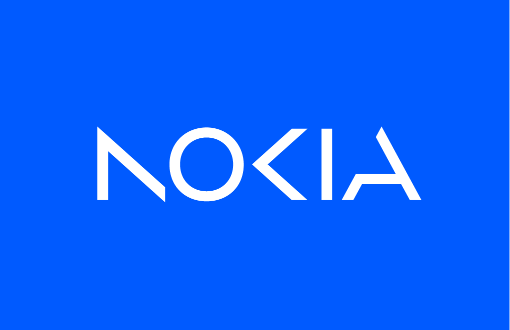
Nokia’s current logo is a futuristic masterpiece! It’s all about being a unique wordmark and standing out with its sharp lettering, which is all in a vibrant electric blue color at #005aff. The letter “N” is designed like a sleek arrow, with only one vertical line, giving it a cutting-edge look. The “K” is also sans the vertical line, adding to the logo’s unconventional vibe.
And if that wasn’t cool enough, the “A” is reminiscent of the iconic SpaceX logo, adding a touch of space-age inspiration to Nokia’s brand identity. It’s a bold and daring design that exudes innovation and modernity, setting Nokia apart as a true trailblazer in the tech world.
By embracing this new brand identity, Nokia is all set for continued success in the years to come. Exciting times are ahead!
Nokia Logo History
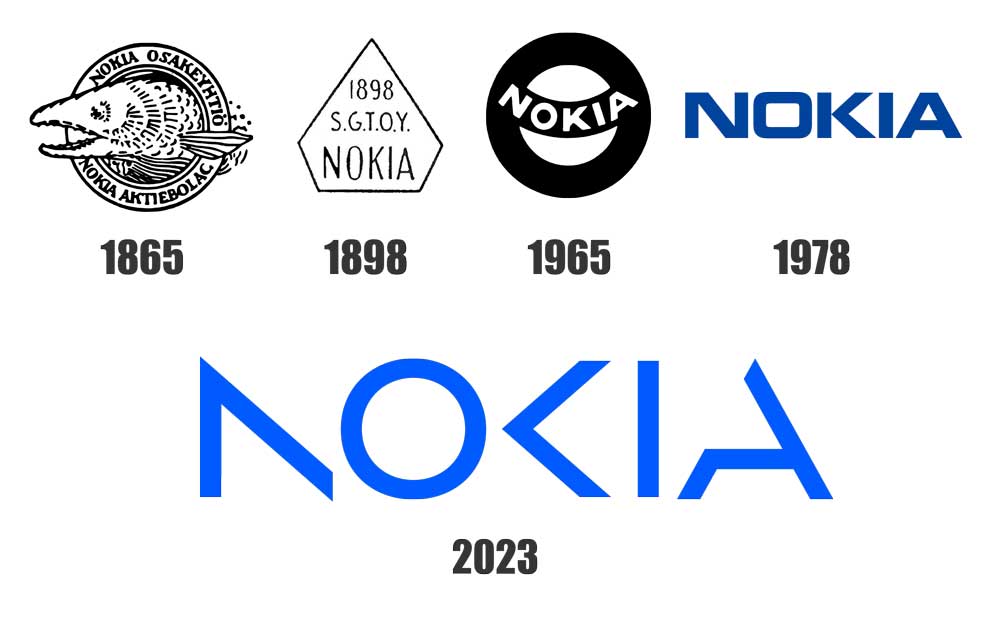
Nokia’s got quite the history, dating all the way back to 1865 when it started as a humble paper mill in Finland. Their first logo featured a salmon head, a nod to the Nokianvirta River that inspired their name. But as Nokia expanded into rubber and electrical products manufacturing in 1898, its logo went through some big changes. It had the abbreviation “S.G.T.O.Y. NOKIA” which stood for Finnish Rubber Factory. Fast forward to 1965, and Nokia adopted a new logo with a black ring and a semicircular strip, representing their specialization in tire manufacturing.
But the most recent change is in 2023 when Nokia introduced a brand-new logo that’s all about being energized, dynamic, and modern. It’s a reflection of who they are today as a leader in technological innovation, especially in the business-to-business sector.
The new logo embodies Nokia’s values and purpose in a bold and forward-thinking way, showing that they’re all about pioneering the future where networks meet the cloud. Nokia has certainly come a long way from its humble beginnings as a paper mill, and this new logo represents its exciting journey of evolution and innovation.
We’re eager to hear your thoughts on Nokia’s new logo! What do you think of its futuristic design, with sharp letters in electric blue? Does it catch your eye and make you curious about Nokia’s brand? Share your comments and let us know your impressions.
Vector AI
Format: Ai (Adobe Illustrator)
Artboard: 1
Size: 248 KB

