Senan’s Stunning Wordmark: A Minimalist Logo for a Modern Recruitment Firm
Yesterday, I embarked on a thrilling journey as I entered the 99designs contest for Senan Advisors – a top-notch recruitment firm that connects talented technology professionals with leading Wall Street companies.
As a designer, I was eager to showcase my skills and create an amazing logo for this esteemed company. Targeting an audience of savvy bankers and software engineers, I wanted to capture the essence of Senan Advisors and convey it through my designs.
I have been putting in countless hours of hard work to come up with the perfect concept for Senan Advisors’ new logo. As a designer, I understand the importance of creating a visually appealing and effective design that accurately represents the company’s brand and values.
I have been carefully considering every detail and pouring my creativity into this project, determined to deliver a logo that will leave a long-lasting impression on Senan Advisors’. Rest assured, I am committed to creating a logo that is sleek, professional, and fun – just like the company itself.
Designs Concept
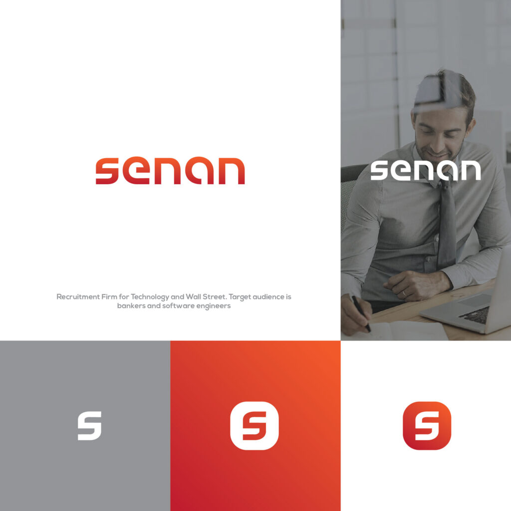
After much brainstorming and experimentation, I am excited to reveal my wordmark logo for Senan Advisors. Inspired by the company’s brief, I took a simple, unique, and fun approach to the design.
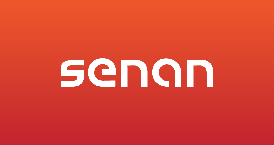
The result is a stylish and eye-catching logo that showcases the company’s name, “Senan,” in a bold and modern font. I believe this logo effectively captures the essence of Senan Advisors and will appeal to the company’s target audience of bankers and software engineers.
S feature
In my wordmark logo for Senan Advisors, I have used a simple and bold font in a one-stroke style. The stand-out feature of this logo is the “S” graphic, which is designed to resemble the combination of two “N’s” at the same time. This creates a perfect identity for the company, as the graphic style suggests the name “Senan” and makes it easy for people to remember.
The use of a simple and bold font, along with the unique “S” graphic, gives the logo a modern and professional look that is sure to appeal to Senan Advisors’ target audience of bankers and software engineers.
The “S” graphic in my wordmark logo for Senan Advisors is not only visually striking, but it is also versatile and can be used as a company icon. Whether it is used on its own or incorporated into other designs, the “S” graphic serves as a memorable and effective symbol of the company.
I believe that this unique feature of the logo will help to establish Senan Advisors as a recognized and respected brand in the competitive world of technology and finance.
Colors
In accordance with the brief, I used the color red in my wordmark logo for Senan Advisors. However, I gave it a little gradient touch to make it look soft and modern.
The result is a logo that is bold and eye-catching, yet subtle and refined. I believe that the use of red, paired with the gradient effect, gives the logo a unique and professional look that will appeal to Senan Advisors’ target audience of bankers and software engineers.
I am confident that this logo successfully captures the company’s brand and values, and will help to establish Senan Advisors as a trusted and respected brand in the industry.
Conclusion
I am very happy and confident with my design for Senan Advisors’ logo. If you’d like to see my design and how the competition is going, you can visit the contest page here. There, you can also view other designs and see what the competition is like.
I hope you enjoy my design and look forward to seeing the final results!
Looking for Simple and Elegant Logo Design Service?
Mrvian is a professional designer who has this style type. Even though the outcome is a simple design but it comes from a thoughtful process in order to produce the most suitable brand for the target audience and brand value. Check out my portfolio to get a feel of my style and don’t hesitate to contact me.

