10 Tips for Designing a Memorable Logo
Designing a logo is not an easy task. A logo is the face of a brand, and it needs to effectively communicate the brand’s values, personality, and style. But with so many logos out there, how do you create a design that stands out and is memorable to your target audience?
In this blog post, we’ll share 10 tips to help you create a logo that is both visually appealing and effective at conveying your brand’s message. Whether you’re a professional designer or a business owner looking to create your own logo, these tips will help you create a design that is memorable and effective.
Start by understanding your brand and target audience

Before you even begin to design your logo, it’s important to have a clear understanding of your brand’s values, mission, and target audience. This will help guide the design process and ensure that your logo resonates with the right people.
To understand your brand and target audience, you can use the following techniques:
- Define your brand values: By defining your brand values, you can identify the core values that define your brand and inform all of your branding decisions.
- Create a customer avatar: A customer avatar is a fictional representation of your ideal customer, which can help you get a better understanding of your target audience.
- Conduct market research: Market research can provide valuable insights into your target audience’s demographics, preferences, and purchasing habits.
- Analyze your competition: Analyzing your competition can give you an idea of what is already being offered in your industry and how your brand compares.
These techniques can help you create a logo that resonates with your target audience and effectively conveys your brand’s message.
Keep it simple

A simple logo is often more effective than a complex one because it is easier to remember, recognize, and reproduce. When a logo is too complex, it can be difficult for the viewer to process all of the information and recall the design later on. A simple logo, on the other hand, is easier for the viewer to remember and recognize, which can help to increase brand awareness and loyalty.
In addition to being more memorable, a simple logo is also more versatile and adaptable. A simple design is easier to reproduce across different mediums and applications, such as on a website, social media, or business card. It can also be scaled up or down without losing its integrity or impact.
This allows a brand to use the logo in a variety of different contexts and ensures that it looks professional and consistent no matter where it is used. Overall, a simple logo is a valuable asset for any brand and can help to increase recognition and establish a strong visual identity.
Use appropriate typography
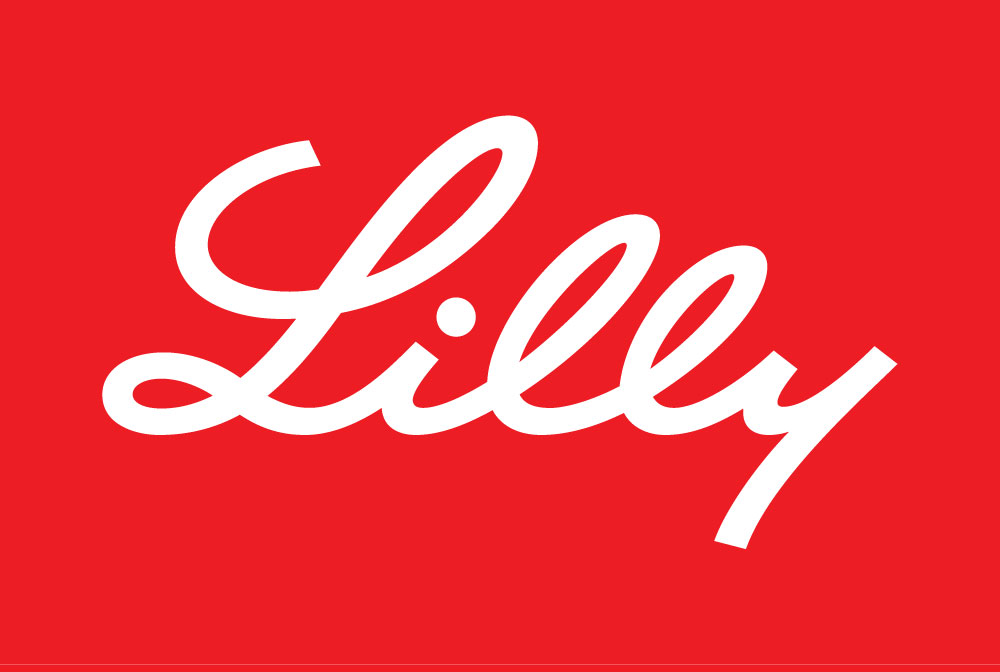
The typeface you choose for your logo can significantly influence how it is perceived by your target audience. It’s important to choose a typeface that is appropriate for your brand and target audience, as it can help to convey the personality and style of your brand.
For example, a bold and modern typeface might be more appropriate for a tech startup, while a classic and elegant typeface might be more suitable for a luxury brand. In the example above Ely Lilly’s logo match their personality which is more pushed human value depicted with handwriting wording style.
When selecting a typeface for your logo, it’s also important to consider readability and legibility. Make sure that the typeface you choose is easy to read, especially in small sizes or from a distance. Avoid using overly decorative or difficult-to-read typefaces, as they can be hard to decipher and may not effectively convey your brand’s message.
Choose the right colors

Color is a powerful tool in logo design. It can convey different emotions and associations, so it’s important to choose colors that align with your brand’s values and personality.
To choose the right colors for your logo, consider the symbolism of different colors, the preferences of your target audience, the use of a consistent color palette, and the testing of different color combinations.
Make sure to choose colors that align with your brand’s values and personality, and that is appealing to your target audience. Use a limited color palette consistently across all of your branding materials to create a cohesive visual identity for your brand.
Experiment with different color combinations to find the one that works best for your logo.
By following these tips, you can choose the right colors for your logo and create a design that effectively conveys your brand’s message and resonates with your target audience.
Make it scalable
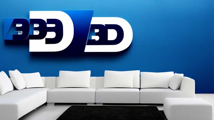
It’s important to design your logo with scalability in mind so that it looks good at any size. Your logo will likely be used in a variety of different contexts, from small social media icons to large billboards, and it’s important that it looks sharp and professional no matter where it is used.
If your logo is not designed to be scalable, it may appear pixelated or blurry when enlarged, which can negatively impact the perceived quality of your brand.
To ensure that your logo is scalable, make sure to design it with clean lines and simple shapes that will hold up when the size is changed. Avoid using too many small details or thin lines, as they may become distorted or difficult to see when the logo is scaled up.
Instead, focus on creating a simple, bold design that will look good in any size. By designing your logo with scalability in mind, you can ensure that it will look professional and consistent no matter where it is used.
Consider negative space
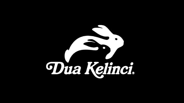
Negative space refers to the empty space around and within an object in a design. In logo design, negative space can be used effectively to create visual interest and depth. By carefully considering the placement and shape of the negative space in a logo, a designer can create a design that is both visually appealing and impactful.
For example, the famous “FedEx” logo uses negative space to create an arrow between the letters “E” and “X,” which suggests movement and forward progress. By using negative space in a creative and intentional way, a designer can create a logo that stands out and is memorable to the viewer.
Use appropriate symbolism

Incorporating symbolism into your logo can be a powerful way to communicate your brand’s values and message in a more subtle and abstract way.
Symbols can evoke emotions and associations in the viewer and can help to create a deeper connection with your audience. However, it’s important to make sure that the symbol you choose is appropriate for your brand and aligns with your brand’s values and message.
A symbol that is unrelated to your brand or that doesn’t effectively convey your message can confuse or distract the viewer. By carefully considering the symbolism you use in your logo, you can create a design that effectively communicates your brand’s message and resonates with your target audience.
Test your logo

Before you consider your logo design final, it’s important to test it out on a variety of mediums to see how it looks and performs in different contexts. This will help you to identify any potential issues or weaknesses in the design and make any necessary adjustments.
You can also gather feedback from a focus group or online survey to see how your logo resonates with your target audience. This can help you to identify any potential problems or areas for improvement and ensure that your logo effectively communicates your brand’s message to your target audience.
By taking the time to test and gather feedback on your logo, you can create a design that is both visually appealing and effective at conveying your brand’s message.
Protect your logo

After you’ve put in all the hard work to create a final logo design that you love, it’s important to protect it from being used without your permission. Trademarking your logo is a crucial step in establishing your brand’s credibility and legitimacy, and it will help to prevent others from using your design without your consent.
By trademarking your logo, you can rest assured that your brand’s visual identity is protected and that you have the legal recourse to defend it if necessary. It’s a small investment that can pay big dividends in the long run, as it helps to safeguard your brand’s reputation and value.
So don’t forget to trademark your logo once you have a final design – it’s an important step in building a successful and sustainable brand.
Stay up-to-date
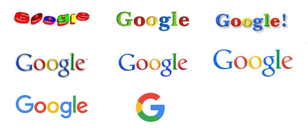
It’s important to stay up-to-date with current design trends in order to create a logo that is fresh and relevant. However, it’s also important to remember that logo design trends come and go, and a strong, timeless logo will stand the test of time.
Don’t feel the need to completely revamp your logo every time a new trend emerges – instead, focus on creating a design that is timeless and enduring.
A logo that is too closely tied to a specific trend or moment in time may quickly become dated and lose its impact. By creating a logo that is timeless and enduring, you can ensure that your brand’s visual identity remains strong and relevant no matter what the current design trends may be.
Looking for Simple and Elegant Logo Design Service?
As a simple and elegant logo designer, Mrvian specialize in creating logos that are impactful, yet easy to remember and recognize. Through a thoughtful and considered design process, I can help you achieve a professional and polished look that effectively conveys your brand’s message. Let me help you create a simple and elegant logo that will make a lasting impression on your customers.
Check out my portfolio to get a feel of my style and don’t hesitate to contact me.


