The Hidden Meanings Behind the World’s 10 Biggest Tech Logos
Every time you unlock your phone, open a browser, or buy something online, you’re interacting with a logo. Most people glance at them without a second thought. But the world’s biggest tech companies didn’t spend millions of dollars on design just to make something that looks nice. Their logos are carefully engineered symbols — built to trigger emotion, communicate values, and burn themselves into your memory before you’ve even read a single word.
This article decodes the visual language behind 10 of the most dominant tech companies on the planet. What you’ll find isn’t conspiracy — it’s design strategy at its highest level.
NVIDIA – The Eye of Vision
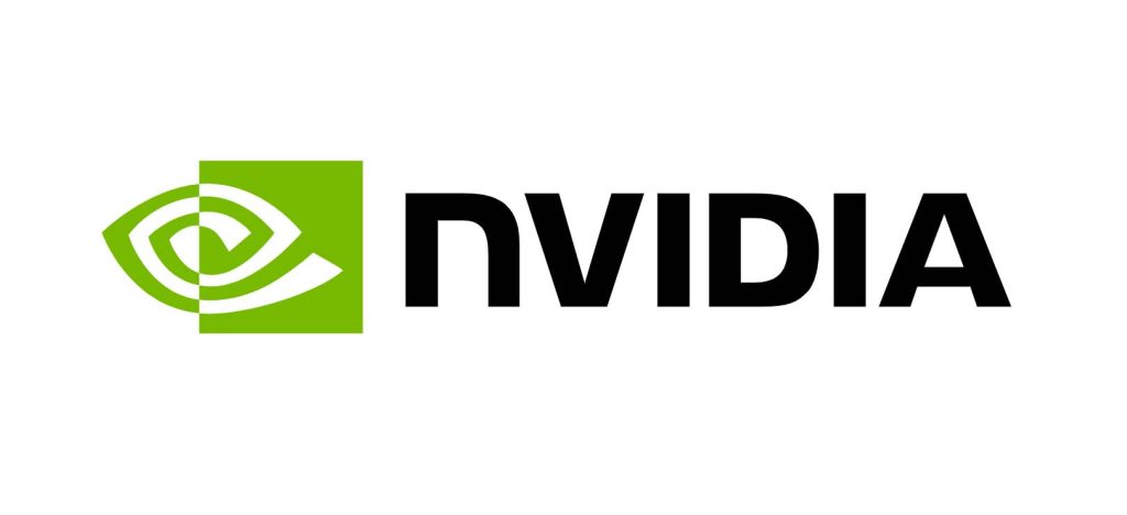
Let’s start with the name. Most people say it without thinking, but the root vidya comes from Sanskrit, meaning “knowledge” embodied in the Hindu tradition by Saraswati, the goddess of wisdom and intelligence. Engineers from Indian tech culture heavily shaped NVIDIA, so this isn’t a coincidence. There’s also the Latin invidia, meaning envy — always wanting what’s next, always pushing beyond reach. Both meanings fit a company that’s spent thirty years making everyone else feel behind.
Now the logo. That shape is an eye. The official explanation is visual perception, GPUs, graphics, and machines that see and render reality. Makes sense.
But I can’t unsee the other angle. That eye sits in a long tradition of heavy symbols, the Eye of Horus, an ancient Egyptian symbol of divine surveillance and power. And for many people, it connects to the Dajjal — the one-eyed figure in Islamic tradition representing deception and a system that watches everything while showing you only what it wants you to see.
I’m not saying it was intentional. But when the most powerful AI computing company on the planet uses an eye as their symbol — the company whose chips are literally training systems that will shape human reality, you’re allowed to sit with that for a moment.
Just know what you’re looking at.
Apple – The Bite of Knowledge
This one I find genuinely hard to look at the same way twice.
The apple as a symbol is ancient. Adam and Eve — the fruit of forbidden knowledge, the moment humanity crossed a line it couldn’t uncross. Isaac Newton, an apple triggers the discovery of gravity, and science leaps forward. Snow White, a bitten apple as temptation, as poison, as transformation. These stories span religions, cultures, and centuries. Apple, the company, picked this symbol knowing exactly what it carried.
The bite is what makes it unsettling when you think about it. A whole apple is just fruit. The bite means someone already took it. Already reached for the forbidden. Already crossed the threshold. The logo is basically saying, “We already ate it, now so will you”.
Then there’s the detail that I can’t ignore. The first product Apple ever sold, the Apple I computer in 1976, was priced at $666.66. Steve Wozniak has said it was just a calculation based on markup, nothing intentional. Maybe. But the number, combined with the symbol of forbidden knowledge from the Garden of Eden, is a combination that a lot of people find difficult to dismiss as pure coincidence.
The rainbow colored logo of the early years eventually gave way to the clean monochrome version under Steve Jobs. When your symbol is already one of the most recognized shapes on earth, stripping away color is a power move. It says we don’t need to explain ourselves anymore.
Beautiful branding. Genuinely brilliant. But the layers underneath it are worth knowing about.
Alphabet (Google) – Colors of Playfulness
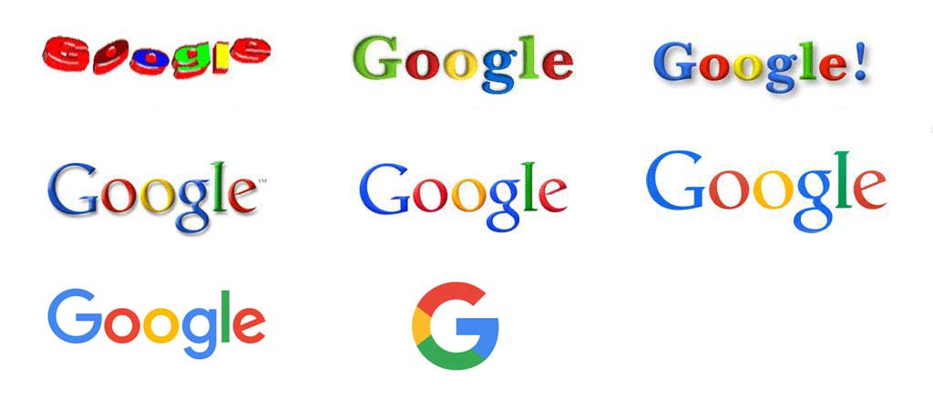
This one looks simple on the surface. It’s really not.
Google’s logo breaks one of the most fundamental rules of professional design: never use primary colors together. Red, blue, and yellow feel childlike, almost kindergarten-level. And that’s entirely the point. By using primary colors with one deliberate exception, the lowercase “l” in green, Google is quietly saying: we follow the rules, but not all of them. Accessible to everyone, but thinking differently. A visual manifesto packed into a four-color wordmark.
The lowercase lettering matters too. Capital letters signal authority and distance. Lowercase feels like a friend talking to you rather than an institution addressing you. For a company that wanted to become the world’s default answer machine, approachability wasn’t optional; it was the product itself.
And the colors aren’t random. Blue for trust and reliability. Red for urgency and importance. Yellow for optimism and clarity. Green for growth and balance. Google packed its entire brand promise into color psychology, and most people absorb it without ever consciously noticing.
But here’s where it gets interesting.
Look at the Google Chrome logo. Really look at it. The circular design with its colored segments has been pointed out by many people as containing hidden 666 shapes within its structure — the three curved sections forming three sixes when traced carefully. Coincidence? Probably what Google would say. But for a browser that sits between you and virtually all of the world’s information, the symbolism is at minimum worth being aware of.
I wrote about this in more detail here — including other famous logos with similar patterns: 5 Famous Logos That Contain Hidden 666 Number
Draw your own conclusions. But once you see it, you won’t unsee it.
Microsoft – The Four Windows
Most people glance at the Microsoft logo and move on. Four colored squares, clean and corporate. Nothing to see here.
But sit with it for a moment.
Each square maps to a core Microsoft product family — blue for Windows, red for Office, green for Xbox, yellow for Bing. Together they form a grid, and that grid represents a window — literally the central metaphor of everything Microsoft has built since the 1980s. A window is something you look through to access another world. That’s exactly what an operating system does. They named the product, then encoded the concept directly into the symbol.
The squares are also slightly tilted, giving the logo a subtle three-dimensionality. It’s not flat — it has depth and perspective. Everything connected, everything layered, everything part of the same system.
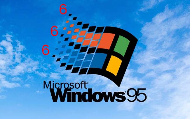
Now here’s where I want you to grab the old Windows 95 logo and actually count something.
Look at the waving flag design — that colorful, segmented window made up of small square fragments. Count the individual square fragments in each black colored section carefully. What you get across the full design, when broken down and calculated, points to a pattern that keeps showing up in this list. The number of fragments, the sections, the way they divide — the math leads somewhere that raises the same question we keep asking with these logos: is it intentional, or is it just how numbers work when designers make grids?
I’ll let you look at the image above and count for yourself.
Amazon – The Smile from A to Z

Amazon’s logo contains one of the most cleverly embedded messages in retail history, and once you see it, it becomes impossible to unsee.
The arrow beneath the wordmark curves from the letter “A” to the letter “Z.” On the surface, this means Amazon carries everything from A to Z, the full spectrum of products. But the arrow is also shaped like a smile.
That smile isn’t just decorative. It’s a direct psychological cue, a visual promise that buying from Amazon will make you happy. In e-commerce, where customers can’t touch products, trust is everything. Amazon used its logo to inject a tiny emotional signal directly into its brand mark: ” We will satisfy you.
The orange color of the arrow reinforces this. Orange is the color of warmth, energy, and enthusiasm. It’s inviting without being as aggressive as red. For a company that wants billions of people to feel comfortable handing over their credit card details, that warmth is a calculated advantage.
The simplicity of the execution is what makes it brilliant. A curved line does all of this work simultaneously: direction, comprehensiveness, and joy.
TSMC – Precision in Simplicity
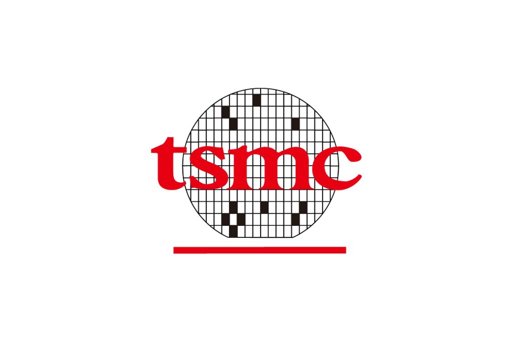
TSMC doesn’t market to consumers. They manufacture the semiconductors that go inside the devices that other companies sell to you. Their audience is engineers, investors, and global supply chain managers, people who value precision above everything else.
Their logo reflects this exactly. A bold red circle paired with a structured grid pattern. The circle represents the semiconductor wafer, the physical disc on which chips are etched in a process of almost incomprehensible precision. The grid suggests the circuit patterns that cover those wafers, rows of microscopic connections that collectively power the modern world.
There is no playfulness here. No curves that suggest friendliness, no hidden smiles, no rainbow of colors. TSMC’s logo communicates in the language of engineering: structure, accuracy, and reliability.
Red is a deliberate choice for an industrial brand of this scale. It signals confidence, importance, and energy. For a company that holds an almost monopolistic position in advanced chip manufacturing, the visual language of quiet authority is the right one.
Broadcom – Connectivity in Motion

Broadcom’s logo is one of the more abstract designs in enterprise technology, and that abstraction is the message.
The wave-like symbol that defines their mark doesn’t represent a physical object; it represents a signal. Movement. Transmission. Broadcom builds the chips and software that make wireless connectivity, networking, and data transfer possible. Their entire business is built on invisible technology, things you can’t see but can’t live without.
Designing a logo for invisible infrastructure is genuinely difficult. How do you visualize a Wi-Fi signal, a data packet, or a Bluetooth handshake? Broadcom’s answer is motion — a flowing, dynamic form that suggests information in transit.
The blue color palette reinforces trustworthiness and technical competence, which matters enormously for a company selling to network engineers and enterprise IT departments. These are audiences who need to believe in reliability above all else.
Tesla – The Electric Motor Symbol
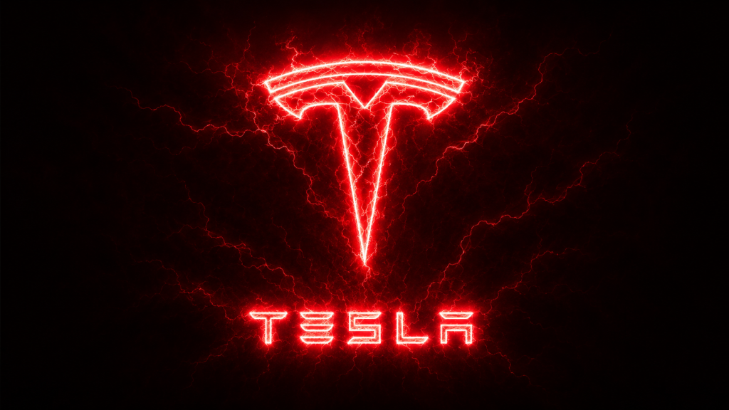
Tesla’s logo is one of the most underappreciated pieces of industrial design in modern branding, because most people see a stylized “T” and stop there.
Elon Musk himself revealed the fuller meaning: the Tesla logo is a cross-section of an electric motor. The tall vertical bar represents the rotor — the part of the motor that spins. The curved horizontal element at the top represents a section of the stator, the stationary component surrounding the rotor.
This means Tesla’s logo is literally an engineering diagram. It encodes the fundamental mechanism of their technology directly into their brand mark. For a company that prides itself on being engineers first and marketers second, this is a profound statement of identity.
The sleek, metallic silver presentation reinforces the futurism and precision the brand stands for. Tesla doesn’t want to look like a car company, they want to look like the future of energy. Their logo, properly understood, is exactly that.
Meta – The Infinity Loop
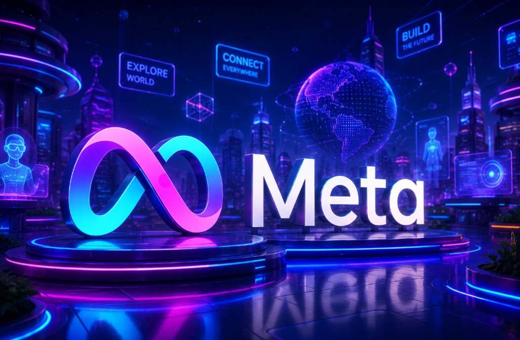
When Facebook became Meta in 2021, the rebrand was about more than a name change; it was an attempt to communicate an entirely new philosophy about what the company was becoming.
The new logo is a continuous loop that forms the letter “M.” The infinity symbol is one of the most universally understood mathematical and philosophical concepts: endlessness, continuity, limitless possibility. By encoding it into their mark, Meta was making an explicit claim about the metaverse, a digital world without boundaries, where physical and virtual existence merge into something continuous.
It was also a deliberate break from the Facebook brand, which had become associated with controversy, data scandals, and the toxicity of social media at scale. The blue “f” carried baggage. The infinity loop carried aspiration.
Whether the metaverse vision has delivered on that promise is a separate question. As a piece of design strategy, the Meta rebrand is a textbook example of how a company uses visual identity to signal transformation, to tell the world, and perhaps itself, that a new chapter has begun.
Samsung – The Global Ellipse
Samsung’s logo is often dismissed as conservative compared to the bolder marks of American tech giants. That conservatism is, in fact, the strategy.
The blue ellipse surrounding the Samsung wordmark is a shape that suggests a globe viewed at an angle — a subtle but consistent reference to Samsung’s global ambitions and reach. Blue, used across virtually all of Samsung’s branding, communicates stability, trustworthiness, and technological competence. These are the exact qualities a consumer electronics brand needs to project when selling premium devices in markets across every continent.
The italic angle of the lettering inside the ellipse adds a sense of forward momentum — Samsung is moving, evolving, progressing. Yet the overall design remains formal and restrained, reflecting a Korean corporate culture that values institutional seriousness alongside innovation.
Samsung has used variations of this logo for decades with minimal changes. In branding, consistency at scale is its own form of power. Recognition built over thirty years in 190 countries is a competitive asset that no rebrand can instantly replicate.
What These Logos Are Really Telling You
Step back and look at all ten of these marks together, and a pattern emerges.
The older generation of tech logos — Apple, Microsoft, Google, Amazon — were built in an era when companies needed to explain themselves, earn trust from scratch, and compete for attention in a crowded marketplace. Their logos are rich with hidden meaning, clever wordplay, and psychological engineering. They had to work hard.=
The newer generation, Meta, Tesla, and NVIDIA, in its evolved form, operates from a position of established power. Their logos lean toward abstraction, geometric precision, and forward motion. They don’t explain. They assert.
And the industrial giants, TSMC, Broadcom, and Samsung, speak an entirely different language altogether. Their logos address engineers, investors, and enterprise buyers rather than consumers. Precision, reliability, and authority replace friendliness and approachability.
Logos are never just a design. They are compressed storytelling, decades of brand strategy, consumer psychology, and cultural awareness collapsed into a shape that fits on a business card. Every curve, color, and proportion is a decision. Every decision is a message.
The next time you see one of these marks on a device, a billboard, or a loading screen, you’ll know what they’re really saying.