Altitude Veterinary Logo Review, PNG & Vector AI
Altitude Veterinary Hospital is a veterinary hospital and pet care center in Wyoming, USA. Their services include medical, emergency, preventive care, surgical, pet transport, boarding, and grooming. It’s a very useful practice for people in Casper Wyoming who have a pet and need pet care service. In addition to pet care, they also open shops to fulfill the demand in this area.
This business is owned by Dr. Richard Schwahn, the veterinary practice began in 1999, and in 2011 he took over and change the name to Altitude Veterinary until now. He also builds a professional team to join this business with education and training to provide better service. There are 5 doctors with their own unique achievements and experience.
Altitude Veterinary Logo Review
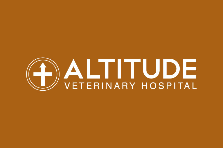
Firstly I saw the Altitude Veterinary Hospital logo on their website altitudevet.com. It sits neatly on the top left of the website as the format is horizontal. The icon is placed next to the text, as a common horizontal logo format. But I find the unique icon which is uncommon in the veterinary logo. Although it pet related the logo is clean of cliche images of dogs, cats, and other animal stuff.
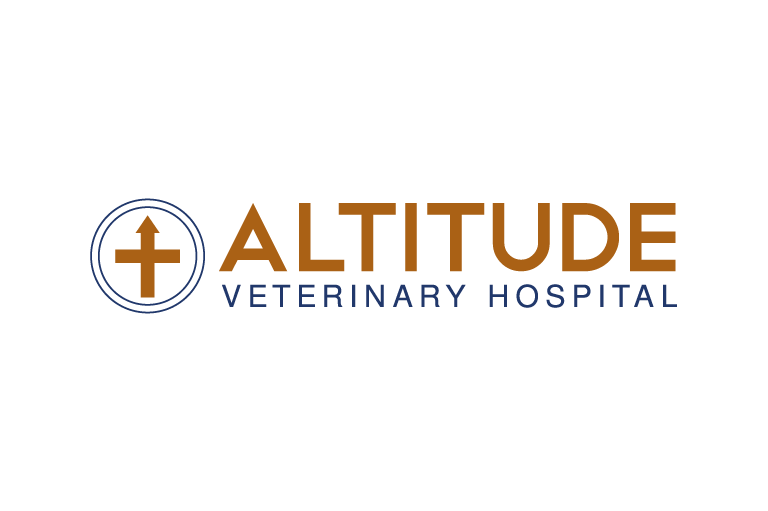
Based on my observation, the owner has chosen Altitude as the name of its company because it represents the higher level of care that their service provides. The Association of Altitude is height and upward direction, this value is also found in the logo symbol so there’s the up arrow shape.
In addition to the arrow, there’s a horizontal line crossing the vertical line with the up arrow which resembles the plus symbol. It’s perfect to remind people about the medical services they offer. But the medical sector they offer is unknown with the icon only, so it always needs text which contains veterinary hospital in order to make people understand. Thus this logo icon is not suitable for stand-alone use cases.
Colors
Based on the original logo preference, the logo contains colors as listed below:
Light Brown: #AA6115 (C:0 M:43 Y:88 K:33) RGB(170, 97, 21)
We can find this color in the plus symbol and Altitude word. This color dominated in pet animals, such as dogs, horses, and cats. So it can indirectly indicate the medical field.
Indigo Blue: #21386B (C:69 M:48 Y:0 K:58) RGB(33, 56, 107)
This color is applied to a double circle and the subtitle, it is very close to dark blue color which can convey trust, wisdom, and professionalism.
Conclusion
Overall this logo is unique and has a meaning behind it. The shapes of the logo are very simple and basic, which looks boring and formal look. I think the sharpness of the shape is not suitable for caring service for cute animals. Especially the sharp arrow can be associated with danger as well as the sharp “A” letter.
An example of a similar brand in this field is Chewy which has a soft look and a cute wordmark logo. But this is a big company for food and pet care. If the logo uses this approach may make it more interesting to young people.
Vector
Format: Adobe Illustrator (AI)
Artboard: 1
File Size: 60.1 Kb
Looking for Simple and Elegant Logo Design Service?
Mrvian is a professional designer who has this style type. Even though the outcome is a simple design but it comes from a thoughtful process in order to produce the most suitable brand for the target audience and brand value. Check out my portfolio to get a feel of my style and don’t hesitate to contact me.

