Harvard University Logo Meaning, PNG and Vector AI
Harvard University is one of the most prestigious Universities on the planet Earth which is currently ranked #2 after the University of Oxford. This university is located in Cambridge, Massachusetts, United States of America, sitting on top of Urban land with 209 acres of campus area.
There are 3 parts of the campus area, one called Harvard Yard, the adjoining campus in the Allston neighborhood of Boston, and the last one is the medical campus located in The Longwood Medical and Academic Area, Boston.
In 1636 Harvard started its operation and was named after the first benefactor John Harvard, the Puritan clergyman.
Harvard Logo History
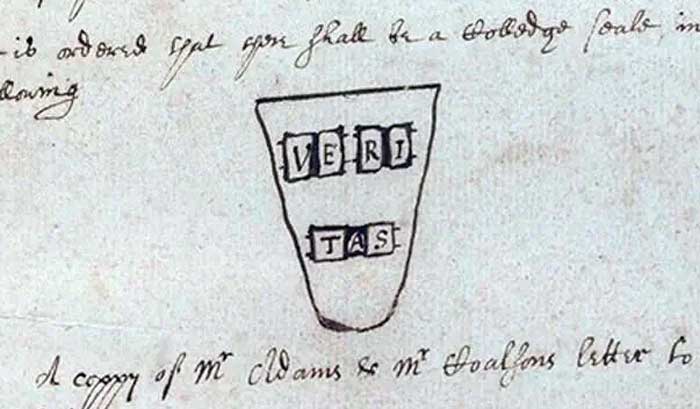
The first rough sketch of Harvard Shield started on Jan. 6, 1644, in the Overseers meeting. This logo origin was discovered on a text record founded on Sept. 8, 1836, by President Josiah Quincy during Harvard’s Bicentennial celebration.

This sketch contains a basic idea of the Harvard coat arm: Shield with the word VERITAS on 3 books. Word “Veritas” is derived from the Latin language which means the Truth in English. Back then in 1843, this logo was adopted as the official corporate identity. Until today, this concept becomes the basic idea of the university logo and its school departments.
Havard Logo Meaning

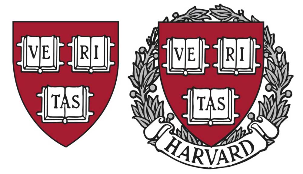
Harvard University is still using the original heraldry, a simple red shield with “Ve-Ri-Tas” words. In addition to that, there are also other separated logos for each school in the university that will not be explained here.
Based on the picture above on the left side, Veritas Shield is used as a base element of the university’s logo. On the right side is Veritas Shield with a wreath and Harvard on white ribbon. Usually, this version is used for other official University purposes to represent the university as a whole.
Shape
The current Harvard University logo is along the emblem logotype, which is usually embroidered as a coat of arms for the official school uniform.
Although the shape of the shield is very simple with a flat top, it actually inlines with 3 book shapes on it that have a relatively flat side. So there’s no useless space, or we can say that this is the most effective shield shape for this formation but still maintain its integrity.
3 books shape that resembles an open book is very unique because it includes a kind of classic cover on the back of each book. A book is a universal symbol to represent knowledge, as founded on other educational logos as well.
Veritas shield with wreath gives a sense of victory, success, and achievement. Overall this logo shape is organic or human-made and classic.
Colors
Havard university has its own red color called Harvard Crimson, a rich deep red color inclining purple. Harvard crimson inspired by sweat wiped from team members that make red on handkerchiefs become darker in 1858. The meaning of this color is energy, power, leadership, courage, humanity, and deep thinking.
List of Havard Logo Colors
- Harvard Crimson Red: #A51C30
- White: #FFFFFF
- Black: #1F1F1F
- Gray: #BCBCBE
Conclusion
The Harvard brand is established for a very long time and is still very consistent without any updates or refreshes. This means that Harvard’s brand is unbounded by space-time and will exist as it is forever. Analogous to their vision and mission of educating the world with science and truth.
PNG & Vector image
PNG


Vector files
Format: AI (Adobe Illustrator)
Artboards: 5
Size: 292kb


