North Central University Logo Review, PNG & Vector
North Central University or NCU for short is one of the private universities in Arizona, United States of America. This university was founded in 1996 and affiliated with the private non-profit National University System in La Jolla, California. NCU was accredited regionally by many organizations such as WASC Senior College and University Commission (WSCUC), Council on Higher Education Accreditation (CHEA), Association for Advancing Quality in Educator Preparation (AAQEP), etc.
NCU offers many degrees that are very helpful to get a better job that includes Doctoral, Master’s, Bachelor’s, Certificates, and Dissertation Completion Pathway. They also have many programs such as Business, Education, Health Sciences, Law, Marriage and Family Sciences, Psychology, Social Work, and Technology. Many graduated students interested in the work they do and are more engaged in their workplace and have better career outcomes.
North Central University Logo Review
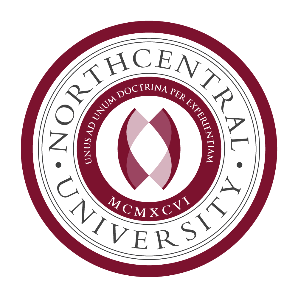
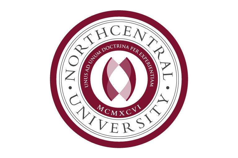
NCU logo is based on a circular form, of text and shape with 2 transparent ribbons facing each other. I’m not sure what the meaning of these two ribbon imagery is depicted in that way. And there’s no official explanation found on their website. There’s only their tagline explained Unus Ad Unum Doctrina Per Experiential. Based on their website the meaning of the tagline is as follows.
Unus Ad Unum (One-to-One): This signifies our one-to-one teaching model where faculty provide individualized feedback and inspirational modeling that enables students to meet course and program outlines.
Doctrina (Education): Translates to education, learning, science, teaching, instruction or principles. It’s a codification of beliefs or a body of teachings or instructions, taught principles or positions, as the body of teachings in a branch of knowledge or belief system.
Per Experientiam (By Experience): Northcentral is committed to enhancing all of our courses toward an applied experiential learning approach – providing our students with an education they can directly apply to their chosen field.
MCMXCVI (1996): The year of our birth – when Northcentral was founded
ncu.edu
The circle is the perfect logo even more perfect with the simple approach of shape, which is very flexible and easy to use in any real-world implementation like stamping, embroidery, and engraving.
I found that it has 2 versions of the logo, the big and the small version that has been used in the navigation bar of their website. The small version contains no slogan so the circle band is slightly reduced, thus increasing simplicity in order to make it able to be scaled down without any small detail intact.

In the big version of the logo, there are 2 fonts used by the NCU logo they are is Bembo and Trajan. But the smaller logo displayed on the website contains additional Times New Roman Font as the title. I think too many fonts included in the logo is not good practice as it reduces integrity and brand consistency.
Colors
Based on the original logo preference, the logo contains colors as listed below:
Claret: #7B122E (C:0 M:85 Y:63 K:52) RGB(123, 18, 46)
This color almost covers the entire logo. This maroon-like color can give us psychological effects like passion, love, anger, ambition, and confidence.
Arsenic: #424242 (C:0 M:0 Y:0 K:74) RGB(66, 66, 66)
This color is only used on the “North Central University” text. Dark grey can convey a neutral and balanced feel to the audience, the darker grey can also represent seriousness.
Medium Ruby: #9B4560 (C:0 M:56 Y:38 K:39) RGB(155, 69, 96)
This is the brighter version of Claret, it is applied on the overlapping region of the ribbon picture.
Pale Chestnut: #D6B3BE (C:0 M:16 Y:11 K:16) RGB(214, 179, 190)
This is the brightest maroon color of this logo, used on the overlapping region of the ribbon picture.
White: #FFFFFF (C:0 M:0 Y:0 K:0) RGB(255, 255, 255)
White is used in the text of the slogan in the circle band. White acts as negative space and can give clarity and strong contrast against the background.
Conclusion
At the first sight, this is a very formal logo and symmetry which is a very common brand image in the university sector. The chosen font also increases the nobility and elegance of the overall design. The color pallet also represents the quality and yet in the group of high-end colors. There is another university that uses this color, such as Pennsylvania University Logo which you can see on my website.
Moreover, the final design depends on their branding value. I just guessing what my feeling about this design is based on the design principle perspective and my opinion.
Vector
Format: Adobe Illustrator (AI)
Artboard: 2
File Size: 1.15 MB
Looking for Simple and Elegant Logo Design Service?
Mrvian is a professional designer who has this style type. Even though the outcome is a simple design but it comes from a thoughtful process in order to produce the most suitable brand for the target audience and brand value. Check out my portfolio to get a feel of my style and don’t hesitate to contact me.

