11 Tips to Get a Simple and Elegant but Modern Logo for your Business
Choosing a logo is a mind-boggling activity, you have to determine the most suitable logo among many options for logo design possibility. Maybe you have a picture of how your brand looks in reality but are not sure how it should when it comes to graphic imagery. This problem can happen to all people when starting to build their businesses.
Especially if you wish to have a simple and elegant but modern logo for your company. This style is usually used for a company that wants to show quality and professionalism in its product or service. I have some tips you might need to consider before choosing your logo.
Choose the least color as possible maybe 2 colors or 3 max

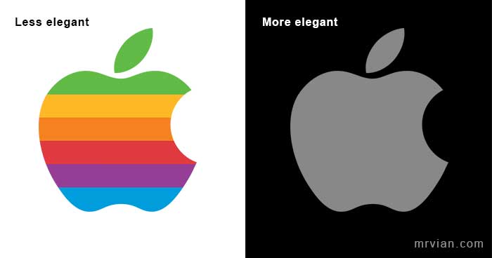
Less is more so is color, if your logo has too many colors the less professional would be. So, consider using the least color as possible, more colors tend to produce a childish impression to the audience. 1 color should be better than 2 or 3 colors, it enhances simplicity, effectiveness, and maturity.
Some brand uses only 1 color including Apple, Nike, Starbucks, Chanel, etc.
Have a neutral or muted color pallet

Neutral or muted colors are part of color that is not too obvious they are. These colors are best for an elegant design style. Avoid color schemes that have striking colors, this makes your logo looks more flashy and tacky. Choosing one color either black or white is the best practical implementation for your elegant logo color.
Have a clean and clear shape that works on 1 color
Having a complex shape is not a good option for a modern logo, instead, consider using only shapes that necessary convey your brand value. It means, your logo doesn’t need a cartoonish element like a border, gradient, or hard color transition in one shape.
The best logo is the logo that can keep its integrity when represented in only 1 color although it has many colors in its default setting.
Balanced graphic element
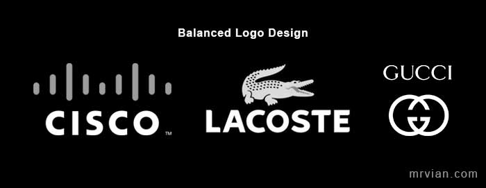
More mature people more balance it would be. Balance is a good manner to give a positive impression to the audience. It represents stability and consistency value for your brand.

It’s not for all cases that you should have a measurably correct center alignment of your logo and text unless you have a geometric symbol. If your logo is organic or non-geometrical, just use your vision to consider the central point based on the weight of its shape.
Less text
Text is a secondary element that speaks to a brand name. Usually used along the symbol of the logo either at the top, side, bottom, or circling around the logo in the center. It usually contains a brand name and slogan, but in some cases, it also shows a company title and established year which makes the text even longer and heavier.
To produce a simple and elegant logo you have to avoid this practice, keep your logo clean by removing unnecessary text. Perhaps a one-word name of your company. So think carefully when deciding your company name.
One typography
Less text is not enough you also need to use one typography style or one font family. Don’t forget to consider the font style that matches your brand style.
Has wide letter spacing

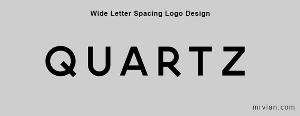
We might have seen some logos that have wide letter spacing such as Gucci, Celine, Quartz, etc. This gives us the impression of high-end, elegant, and prestigious at the same time. Wide letter gaps tend to make relieve our eyes and easier to read, especially when applied in small sizes.
Use sans serif
More modern more simple as well as the font style. Sans serif font typeface minimizes unnecessary shapes that are used for decoration in a serif font. So more simple and readable for the sans serif rather than a serif font.
Serif has a small extension on each tip which usually gives us an elegant and classy impression. But this font has a classic side that is often applied in the old design environments. To address that issue there are sans serifs font that offers an elegant serif width style such as Optima, Audrey, Belleza, etc.
Thin graphic weight
All logo elements including font and symbols should be presented on a thin line if you want to give an elegant feeling to your logo. On the other hand, you have to keep positive space as slim as possible such as avoiding bold font and choosing a line-based symbol.
Be careful when using a thin font, too thin can lead to unreadable, especially when scaled down to a smaller size. If this becomes a concern you can still use the bold font but choose the elegant one.
Remove fancy 3d effects
Avoid 3D effects such as drop shadow, gradient, flashy, bevel and emboss. Besides looking tacky it can make the logo hard to reproduce in the real world.
More contrast more elegant

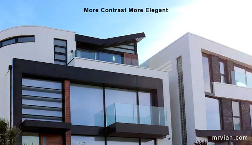
In addition to enhancing clarity, a good contrast can increase an elegant perception of the audience. This contrast design also applies to many things such as cosmetics, and minimalist houses. If you are willing to use multiple colors choose the complementary color palette. And make sure to place the logo in complementary background color as well.
Looking for Simple and Elegant Logo Design Service?
Mrvian is a professional designer who has this style type. Even though the outcome is a simple design but it comes from a thoughtful process in order to produce the most suitable brand for the target audience and brand value. Check out my portfolio to get a feel of my style and don’t hesitate to contact me.


