The Hidden Meaning of Cambridge Logo Design, PNG & Vector AI
Cambridge University is one of the oldest universities in the world. This university existed since 1209 AD. And most of the great scientists in the world has been graduated from this university such as Isaac Newton, Charles Darwin, Stephen Hawking, and many more.
Cambridge university was named after the ancient city Cambridge in the East of England. Located in the center of the city with the majority of the university population in 288 hectares area called university town. More than 20,000 thousand graduated students with 121 Nobel Prizes from alumni and faculty.
In addition to academic departments and administration of the central university, there are also 31 separate groups of colleges under Cambridge university. Each college contains a community of students, staff, and academics.
Cambridge Logo History

Cambridge coat of arms was granted in 1573 during the visitation of Cambridge County by Robert Cooke, Clarenceux King of Arms and a graduate of St. John’s College. This heraldry or blazon is used by Chancellor, Masters, Fellows, and Scholars as a corporate body, back then.
Hidden Meaning of Cambridge Logo
Cambridge logo consists of text and a shield next to the text.
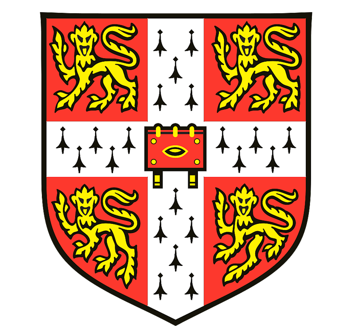
The shield is a central identity that unchanged for over 800 years. This shield is a very valuable asset that represents the excellent academic and high-quality standards of reputed universities in the world.

The heraldry has red gules with a white cross of ermine fur between 4 lions passant guardant walking with one foreleg raised and head facing the observer. In the center of the cross, there is a classic book with clasps pointing downward.
Why there are lions? lions passant guardant is a common element used in heraldry that symbolizes royalty, courage, strength, and nobility of university.
The fur of ermine on the white cross represents dignity and bibble in the center of the cross represents Christian faith.
Gules is a tincture in heraldry that can give a message of a warrior, martyr, and military strength.
In addition to the coat arm, there is a motto “lucem et pocula sacra“, Latin words which mean “From here, light and sacred draughts”.
Text on the logo currently uses the modified Sabon font family a serif font by linotype in 1960. This font gives elegant look as Trajan does in many corporate logo designs.
Conclusion
The University of Cambridge is a well-established entity that keep its original branding over the centuries. In modern-day, this heraldry type of logo still exists as a heritage that must not be replaced. Despite of current logo design trend is tend to be simplistic, an ancient logo doesn’t have to do so.
Logo Specs
Type: Combination
Color:
- Raisin Black #1F2120 (C:0 M:6 Y:3 K:87) (R:33 G:31 B32)
- Red Salsa #FF3643 (C:0 M:79 Y:74 K:0) (R:255 G:54 B:67)
- Vivid Yellow #FFE00F (C:0 M:12 Y:94 K:0) (R:255 G:224 B:15)
Font: Sabon (Customized)
Logo PNG & Vector
PNG

Vector
Format: AI (Adobe Illustrator)
Size: 198kb
Artboard: 1
Note: This is not an official brand resource. If you want to download official complete brand resource files you can go over their official website.


